Joy – Part II

Despite all your lovely and generous comments on yesterday’s post, I felt my little birdie was crying out for something more and this morning I woke with another of my genius ideas – I could frame it – just to see how it looked.

I rummaged around in the magic cupboard and eventually emerged with a somewhat battered and grubby frame.  I didn’t even stop to do more than give it a cursory wipe-over before popping in little Joyful birdie and voila 

Bird framed

The frame measures 42 x 30 cm and the painting is 29.5 x 21 cm.

Oh Joy!! Tra-la!!  Happy Dance!!!

Now she is completed!

What say you?

Thanks for coming by today, I love that you did!  🙂

Joy

I’ve been working on this piece for several days – it started as one thing and, as so often happens, morphed into another.

I am determined to continue in my practise of using colours that are not common to my palette – it’s good for me to stretch my wings…  This one started off with red and orange, which should be fine as they are side by side on the colour wheel –  but when the green came along that simply didn’t work so I morphed the orange into yellow in an attempt to lift the image.

Zing!!

I have developed a decided love/hate relationship with it!

I love my little birdie, I hate the composition!  It’s messy and crowded and the bird is in the wrong place …………  I really need to develop a plan of action before I start drawing and painting and gluing random bits down ……. so much to learn!! 🙂

And it’s an awful photo – there is so much sparkle and texture that it seems to be impossible for the camera to get its act together.  That shadow in the lower left corner is I believe my head.  The floor of the conservatory is the best place to take photos – the sun was shining and it was close to midday……… Sigh!

I’m sounding decidedly grumpy to my own ears –  but I’m not really – maybe the combination of red, yellow and green doesn’t agree with me – though it is decidedly summery 🙂

I shall get it scanned and see what I think about it then – maybe it might make a nice card….. or it may just end up in the art archives folder

Bird2

Click on the image to get a bigger view, click again for detailed viewing.

Mixed media collage on  A4 300gsm art paper.

Acrylic paint, papers, stamps, paint pen, gel pens, charcoal, pitt pens, gold metallic pen and Inca Gold paint.  Heart punch by Sullivans and butterfly punch by Martha Stewart.

The original layer is two shades of red and some white acrylic paint.  When dry I stamped with three different stamps and applied gesso through a template randomly.  A third coat of thinned white paint was applied and wiped away while still wet to grunge it up a bit.

The bird was drawn freehand on lunch-wrap paper [deli paper to some of you], painted and then fussy cut and glued down to the substrate using gel medium.  I stuck her down too far to the left.

The tree branches were also made originally on deli paper and attached to the substrate.

The flowers and leaves were all made from  200gsm paper which was painted and then dry embossed and punched out in two sizes using heart punches. When they were assembled and attached to the substrate I went in with pens and pencils and paints and gussied them up some.

When everything was in place I used charcoal and pitt pens to define edges and bring it all together.

What do you think?

When you look at it do you feel joy?  Or do you, like me, sigh and think  – oh, that could have been so nice!  🙂

Onwards ans upwards!!

Thanks for coming by today, I love that you did!  🙂

A Gardener…. Another Mixed Media Painting

In conversation recently it was noted that I’ve been using blue greens quite a lot as that appears to be my latest colour crush.

Totally, I agreed, any colour associated with the sea seems to be my thing at the moment.

The conversation took an unexpected turn when it was mentioned that orange is a colour never seen in my work.  On quick reflection I had to agree, it is never seen…..  I didn’t even have an orange paint tube, though I do own a Distress Ink that is orange and it mostly sits unused at the bottom of the pile.

It was wondered if I use much of any of the hues from that portion of the colour wheel – the yellows through reds.

I use yellow quite often I said.  A quick hunt through current work and then photos of past work proved the point, I use yellow with blue very often and make lovely greens with them.

I use red I said.  By golly yes I do, a little is to be found in most paintings.  Whew!!

So I set out to do a painting that didn’t feature any sea type colours and did feature yellow and orange.  I even purchased a tube of orange paint!

As I worked I found the colour palette quite heavy [surprisingly – orange should be light and refreshing like it’s name] so I started to add in white which made a huge difference and when I had another of my genius ideas and used the edge of a rectangular paper doily as a frill on the bottom of her dress then things began to pop.

I had no idea what I was going to do when I started and was over halfway through before I could see where we were going – and this is what emerged:

A Gardener [c]

Half successful only, I couldn’t help myself the background just had to be what it is 🙂

I wish I’d chosen a longer canvas to work on so she could have been full length instead of cut off, but that’s what happens when you don’t have a plan!

As I was making the flowers, I  found I was thinking of my blogging friend Alys over at Gardening Nirvana and the words just popped into my head.

So what is your opinion of my attempt to use orange?

Thanks for coming by today, I love that you did!  🙂

Sitting In The Sunshine – Musings on a Challenging Weekend

‘The Nightmare of Being Technologically Challenged’   I typed the title for my new post and settled in for a bit of a gripe.  It was a challenging weekend trying to sort out all the glitches that had surfaced in my Etsy shop – I thought it was all going way too smoothly!

Luckily for us all, I immediately got interrupted – and leaving my computer, went off to take coffee in my tiny courtyard garden with YD.

The coffee was hot and strong – a bit like the early summer heat – and the remnants of my grumpy mood evaporated like drops of water on a hot stone as we inhaled the scent of jasmine and lavender

Courtyard Garden

Can you see Sidd?  His head and cap are just visible under a drooping raceme of jasmine.

[I know it’s not really a raceme, but it’s a good word and needs using!]

And yes, though are weeds in the foreground. [Hangs head in shame]

YD had lots to share from her week and we chatted and laughed and let the sun warm us until the coffee was gone and then we headed off to the post office to send Elaine her prize, the limited edition print of ‘Be a Butterfly’, and also to have a look through a shop selling local artisans work.

We heard a sad story there – the owner will close at Christmas as business is too slow to keep going.  Her stock is stunning, she keeps her prices at an affordable level [which means she isn’t adding a huge mark-up] but she can’t compete with on-line sellers.

I felt guilty.  I had spent last week cat-sitting and making sure my shop was stocked with pictures and cards………   

The shop opened on Thursday and my first day was one of great happiness!  Maybe what happened next was karma for being part of the movement that is sending real stores out of business….

Because on day two it all went wrong – there were glitches and problems galore until I was tearing my hair out and found myself on Sunday raising my voice to an automated customer service robot over the phone demanding to speak to a real person.

And blow me over and away, I got a real person and we began to solve the issues!  🙂

Take note dear readers, when you are stuck with a virtual customer service person, get hot under the collar and demand ‘a real person’  and you will maybe get one.  I guess they must be programmed now to respond to irate customers by handing us on!

Anyway the issues are solved and all is well again in my world.

Yesterday, with YD returned from her travels and Stanley once more settled in with his mum and Orlando no longer having to sniff out where I’d been going constantly [coming back smelling of another kitty doesn’t really go down that well with spoilt, over-indulged chappies] I was free to try and find my creative mojo again.

I’m still obsessed with faces and seem to have combined that and my obsession with the ocean into one place:

Listen1

Painted on A4 160 gsm water colour paper, she is definitely mixed media – acrylics, modelling paste, paper, pencils, charcoal and pens.

The legend reads ‘Listen, how the wild sea calls to me’  She is heavily textured with all the paste and needs to be in a frame to really look her best.

There is much about this piece that is successful or interesting, but my personal feeling is that her stare is too challenging to be marketable – I think she is maybe channelling my weekend mood….. 🙂

Tomorrow I shall start again.  It will be a new day and the sun will still be shining.  The scent of jasmine will still waft in through open windows and with no distractions maybe my paint brush will make something beautiful.

Thanks for stopping by today, I love that you did 🙂

……And The Winner Is …….

It’s the 14th – well, for we who dwell in the land that sees the first rays of the sun on any new day, it is  – and today is the day!

The Contented Crafter Etsy Store is open and the draw has been drawn!

There was one slight glitch in my plan and that was YD’s going out of town for the week – she was to be the guest drawer.  So it was down to me as Orlando is no use in that department at all and everybody else was at work.

Every person who commented had their name written in my lovely scrawl on a piece of cut up paper from my notebook – thirteen in all:

Draw1

If you can’t see your name, it’s because it is underneath somebody else’s – it is there I promise – I just didn’t think to lay them all out side by side.  Sometimes it’s your blog name and sometimes it’s your actual name – just depending on which one fell out of my head as I started writing………

Here is the chosen receptacle, my favourite ‘shabby chic’ style coffee mug:

Draw2

Here are the names in the receptacle

Draw3

They don’t take up much room!

I put my hand over the top of the mug and shook it energetically, then, without looking, rummaged around and pulled out a strip of paper

Draw4

Congratulations to Elaine over at fingerprintwriting.

Elaine, you will need to email me your address so I can get your numbered and signed limited edition print of ‘Be a Butterfly’ away to you

BeAButterfly1

Thank you to everyone who took the time to comment, I so appreciate all your good wishes, advice and cheering on!  Hugs to you all!

Thanks for coming by today, I love that you did!  🙂

Be A Butterfly

Hello my lovelies!

I have been quite busy this past week – I took a leap of faith and decided to go for the Etsy shop thing – sooner than I had originally thought I might.  This decision was in no small way brought about due to the ongoing encouragement and support from my blogging pals – none of whom I personally know, but all of whom I feel I really know!

I cannot say enough about those of you who consistently visit and leave comments and words of encouragement.  I work mostly in isolation and your feedback has been pivotal in keeping me on task and determined to grow as an artist [chuckle – it still makes me smile…]

So to those loving, caring, loyal, helpful, beautiful gals – big, big hugs, tons of love and an unspeakable amount of gratitude zipping out from here to you!!

To celebrate the opening of said shop ‘The Contented Crafter’ – of course, what else – I painted a small mixed media canvas featuring a faery girl and butterflies.  She will be the first original mixed media canvas in the shop:

BeAButterfly1

This is a smallish exhibition canvas – just under 20 cm square x 3.5 cm deep [8 x 8 x 11/2″]  Worked in acrylics with water and ink pens, stamps and glitter. [You’ve gotta have some bling!]

There will also be larger limited edition prints and blank all purpose greeting cards of this faery girl in my Etsy shop.

To celebrate the opening of my new creative venture I am giving away the first numbered and signed limited edition print of this canvas to a randomly chosen commentor on this post.  You have until the 13th to comment.

The draw will take place on the 14th November, which is also the same day The Contented Crafter Etsy shop will go live   🙂   [Ooooh, exciting!]

All commenters names will be written on slips of paper and placed in a randomly selected kitchen container and the winner’s name will then be selected by someone who is not me.

So dear readers, I hope you like her and want to take a punt.  🙂

‘I’m the One’ Mixed Media Canvas

Hello my friends!  The sun is shining, the flowers are blooming and the paintings are coming along quite nicely  … Hurrah!

Here is the latest 30 x 30 cm canvas:

I'mtheOne


This has been created especially for someone very close to me.

The message, while humorous, also has a serious intent.  Even when that special someone comes into your life it is important not to lose yourself.

Do you agree?

Thanks for dropping in today, I love that you did!  🙂

Can a Gaudy Tart Change Her Spots?

Hello there!  Thanks for coming by to check on my doings – I love that you took the time!

Right now I’m taking an on-line course in a [for me] totally new way of art journalling.

By now you may be aware that I’m a kind of an ‘all or nothing’ gal – I work on things for hours, and sometimes even days, I don’t quit until it is embellished to death and the brighter the better!

As my kids tell me, in a loving way, of course 🙂  ‘You’re such a gaudy tart!’

I embrace my gaudy tartiness – my motto is:

There is no such thing as too much bling!”

[If you require proof may I refer you to the post ‘The Adventures of a Prima Doll Stamp’. You’ll find it about 5 posts back]

I started this on-line course so happily, a new challenge, I thought, would be good for me.  I like to learn and I feel I have become a bit stuck in a rut – This, I thought, is my chance to change things up, to take a step towards becoming the artist I dream I might be one day when I grow up …..

But the reality is somewhat different – for a start it’s just  ten minutes a day.  When the time is up, it’s up.  Put down your pencil-paintbrush-spray-pen-whatever and walk away! 

Walk away!

Oh, the indecision, the struggle – the sheer disbelief!

‘Really?’ ‘That’s it?’  ‘But I’m just getting started …’“But, I could just do ….’  ‘But …..’ ‘But …..’  ‘But ….’

It’s no good, I’m just talking to a pre-recorded  video!

It is CHALLENGING!

Here is the first few days work; [click on the photo for an enlarged image]

Aug13 jffb1

If you look carefully you can see this is four days work – and when I look at it now I can’t see much difference between this and some of my previous journal pages that I have laboured over for hours ….

Try as hard as could I couldn’t help myself and I did spend a little more time on the last day.  I added in the black circles with white centres all around the edges of the pages, the white daisies under the photo of the old chair and the clump by the tree, and of course I doodled the ‘Happy’ word after time up as well … well, you just gotta have some bling somewhere!

But, all in all, the colours are muted, the layout is simple, the embellishment is not 2D, the texture is simple. …. and I find I kinda like it …..

So, unlike the Leopard, maybe this gaudy tart might just alter her spots, just a little …..

What do you think?

The Adventures of a Prima Doll Stamp

I got myself a new stamp.  It is so pretty!

Now before we go any further I just need to tell you that I was never able to be a little girly girl when I was a little girl – and, as a result, I have never quite gotten past the frilly-blingy-dress-up-pretty stage – ’nuff said?

So here is the stamp – she’s quite a tall lass, standing about 20 cm [8″] and the primary colour used in the composition, Distress Ink  ‘Peacock Feathers’ an absolutely delicious colour:

Prima Doll Stamp

And this is what I did to it:

Prima 2

Sh is coloured with water colour pens and the dress is over stamped in a pattern by randomly plonking a small swirly type stamp over the four colour base.  Even though the dress has a sort of bottom frill, i wanted more, so made the fabric look frill from paper coloured in the same way as the dress and then pleated and shaped to get the look of movement.  It’s topped with a row of tiny pearls.

She looked a bit cold so I took a piece of narrow white cotton lace and turned it into a shawl. Later, the harsh white will be softened with a few dabs from the green and blue colour palette.

The next day I decided the black was too harsh and did this:

Prima 3a

Tiny pieces of my encyclopaedia paper are glued down and brushed with some gold ‘Perfect Pearls’  which also made their way onto the gown  The edge is treated to some ‘Peacock Feathers’ ink.

Now she needed to rest a bit while I had a think about where to go next – did she need to be affixed to a double layer of scalloped edged card?  Did she like having flowers around her?.  I often stand my half completed work out where I can see it when I’m doing other things.  Getting a glimpse of it when I’m not focused on it, helps me know what is needed as a next step.

The little fella likes to get in on the action too:

Tig & Prima

She spent an evening out of the play room and when she went back in this happened:

Prima 4

I think she’s finished – but you can never be quite sure …… not until she is safely tucked up in her cellophane bag or gone to her new home!

Thanks for coming by 🙂  I hope you enjoyed your visit, do let me know what you think – constructive criticism is always appreciated!

Hand Made Flowers and Me

My last post had such a lovely reaction from my few faithful readers and also brought a couple of questions via email from my non-Wordpress readers – that I thought I’d try a brief explanation of the different types of flowers I make and especially how I make hand rolled flowers.

I make so many flowers – mainly due to the absence of mojo – that last Easter I put some into a bowl and made a little centrepiece for my table.  It still survives, mainly as Orlando has no interest in it due to the fact that these flowers don’t smell pleasing to him.  They don’t smell at all.

Bowl of flowers

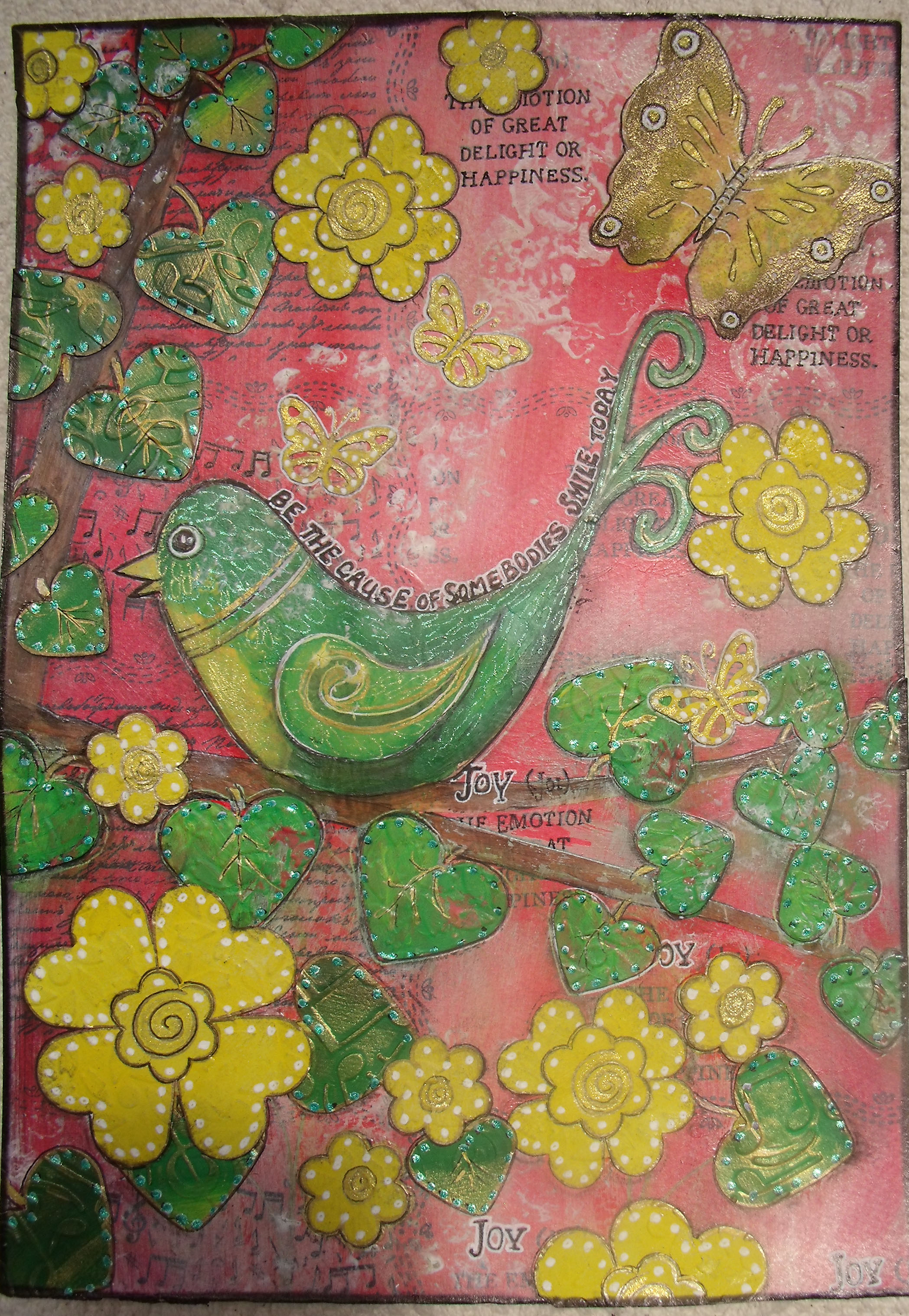
This is a good example as it has lots of different kinds of flowers made with different kinds of paper.

Some time back when YD and I made a trip to the local junk shop, we scored big time in the book section.  We picked up some big books – almost A3 size – a cook book, a Kaffe Fassett knitwear book and a travel book.  All glossy pages and fully and colourfully illustrated.  The books were 50 cents each.

I also scored an old Brittanica Encyclopaedia [B] which is the mother-lode really, for 20 cents!  These books were made to last forever, they are made with high grade paper and high quality inks.  The pages don’t discolour or bleed or degrade with time.  I use this book paper for all my pages that want to have words somewhere in them and I have not made a discernible dent in the density of the book yet.

The other three books are my suppliers for the ready coloured flowers.  I have to admit that as a book-o-phile I was quite challenged at the thought of tearing pages from a beautiful book to make flowers, but once the first page was torn and the first flower made, I was on the road to hell!

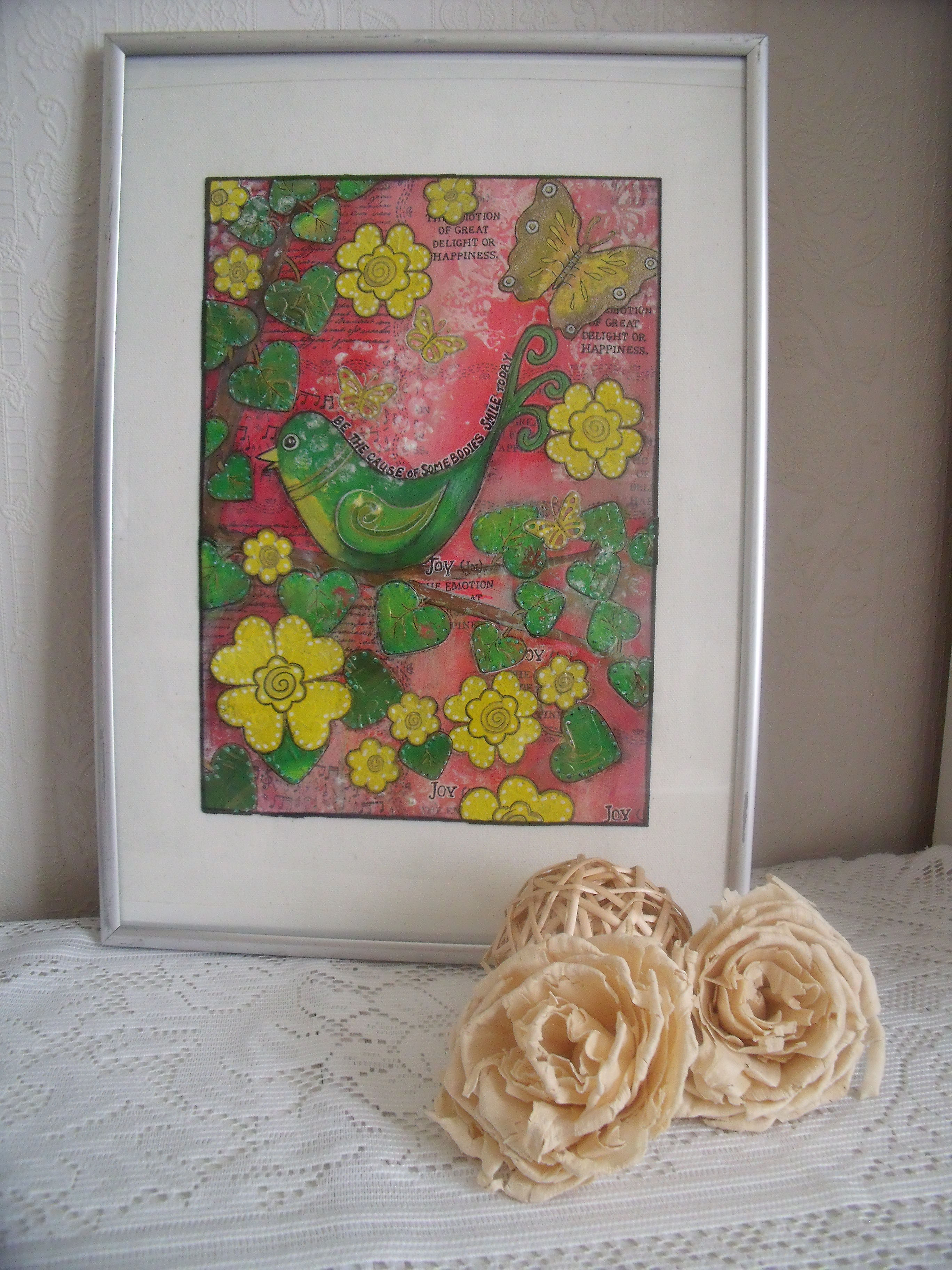
The pic below stars a suitably autumnal flower made from the cookbook.

Bowl of flowers 6

These glassine flowers are made with a die, nothing to it really just cut out and layer up:

Bowl of flowers 3a

But today we are primarily concerned with these little blue beauties:

Bowl of flowers 1

You will need:

Book pages

Scissors

Tweezers or quilling tool

Pokey tool 🙂

Glue gun

Colouring agents: water based inks – I use Distress Inks; glimmer spray of some kind works well too, glitter if wanted

A favourite TV programme – and off we go!  [Just fyi – I’m a late comer to Grey’s Anatomy.  I’ve been watching for about a month and am up to series 3 – hooked!]

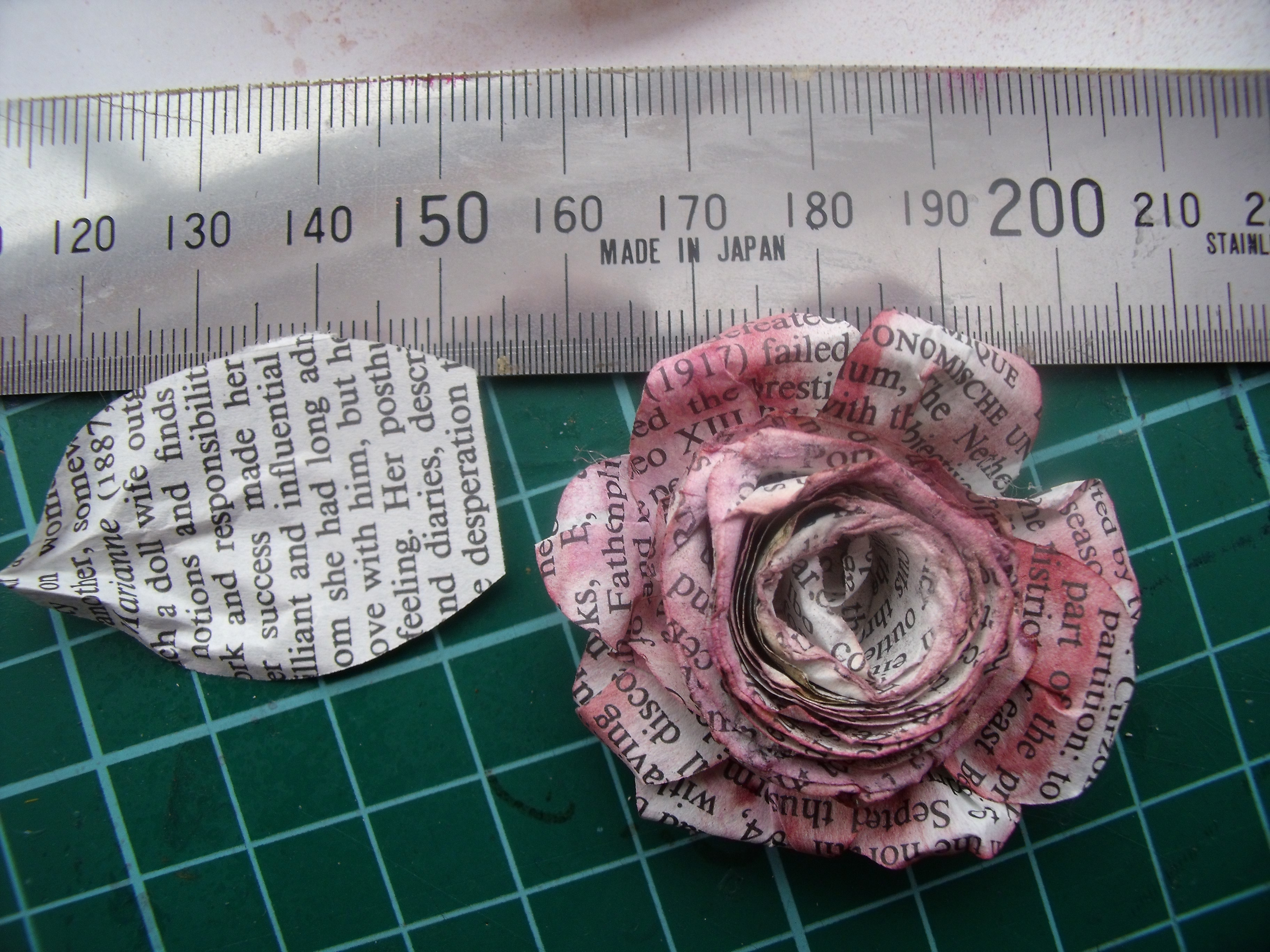
Cut your book pages into circles.  The bigger the circle, the bigger the flower.  I tend to make circles somewhere in the vicinity of 6 -8 cm [2 – 3 inches]  Next you will spiral cut into these circles.  It’s important to understand that the narrower the gap between spirals the flatter the flower will be.  And it depends on how you want to use them – a high standing flower doesn’t work well on a card for instance, but looks great on a canvas……  I like to make my cut slightly wavy as it gives the top of the petal a more natural look.

The following blurry photo is my attempt to show you the cutting and rolling process:

BP flower unrolled

There will be a small circle left at the end of your spiral cut, this is the base of the flower.

Using the tip of your tweezers grasp the outside edge of the spiral cut, with right side facing roll up the paper keeping the bottom edge as level as possible.  I roll quite tightly then let the flower unroll a bit to find its happy place.

I make a big pile of flowers up to this point – and I maybe cut out a few dozen petal/leaf shapes as well.  For the next step I retire the TV and return to the play room.

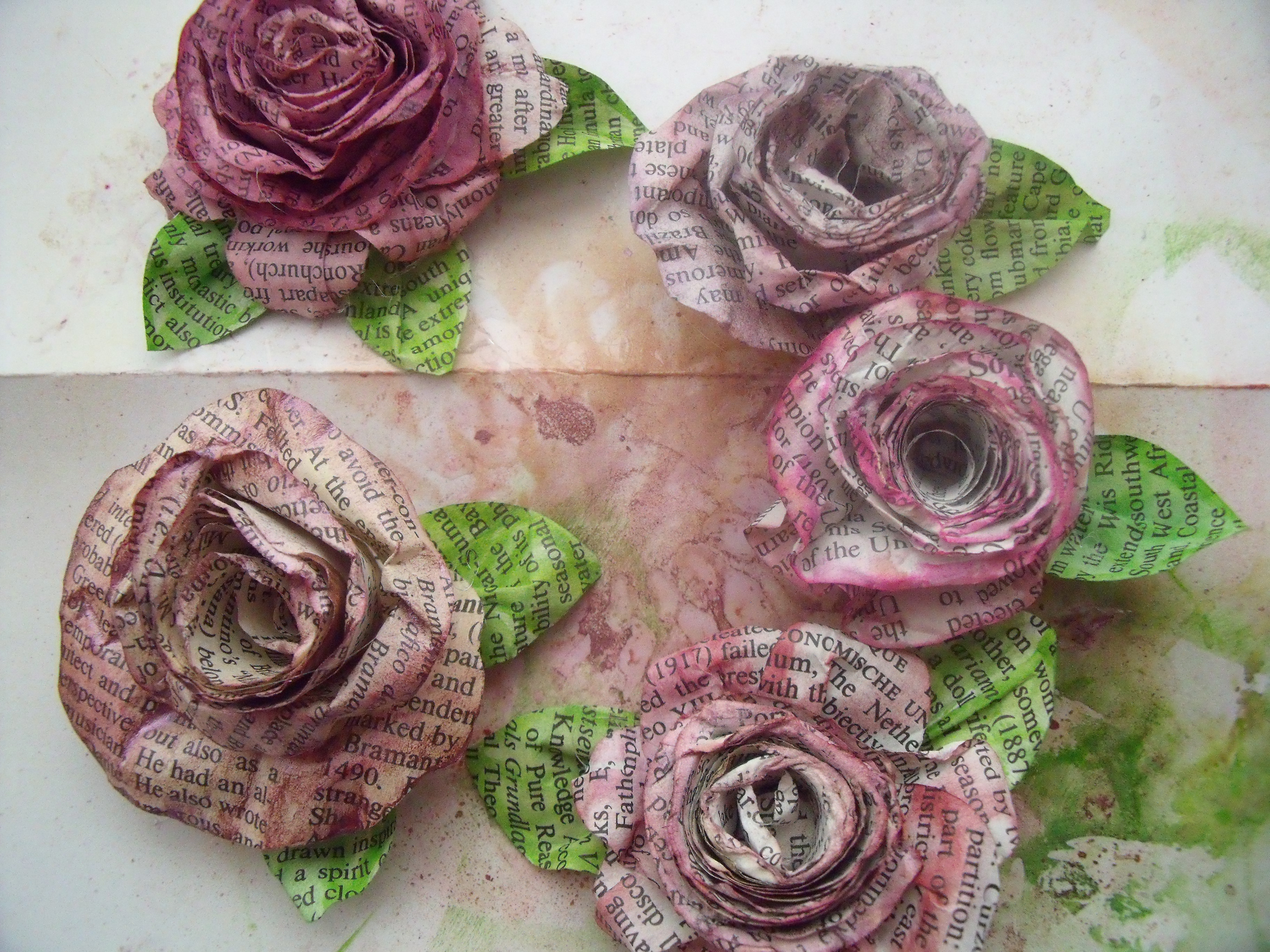
I hot glue the spiral cut flower to the base.  Hot glue is best, it sets quickly before the flower can escape the shape you have chosen.  Lately I have learned to add an extra layer of ‘petals’ to the outside edge.  I flip the flower over and, making a pleat in the bottom of each petal, I hot glue an odd number onto the base, overlapping as I go.

Now I add colour.  Sometimes I colour with a product like glimmer mist, but typically I use water based inks, swiping the pad along the top edge of the flower and outside petals quite strongly.  Then I spritz with water.  The ink will bleed and spread the colour.  Don’t use too much water or you will have a soggy pile of wet paper pulp [yes, I’ve done it!]  While the flower is still damp I like to use the tweezers and roll back the petals, especially on the outside of the flower.  Denting, stretching and making little tears is all okay, it adds to the natural look.   Leave the flower aside to fully dry.

The flower on the left has had the extra layer of petals added, you can see the difference, right?

BP flowers 2

Now I make leaves.  I forgot to photograph this part.  But it’s pretty easy.  The left overs from the petals you glued on in the last step will now become the leaves.

BP flowers 3

I swipe some green ink on.  Draw a centre spine and some veins with a green water based pen – I use Marvy’s but anything will do – then go back in with my water brush and bleed the colour out.  I scrunch them up to and make a pleat before gluing one or two or even three to the bottom of the flower.  The pleat is important as it makes the leaf stand up and have body:

BP flowers leaves

Next is the fun part.  BLING!  You can never have too much bling, even on book paper flowers…..

I inserted half pearls into the centres and employed the wipe on – wipe off method with some glitter on flowers and leaves:

BP flowers bling

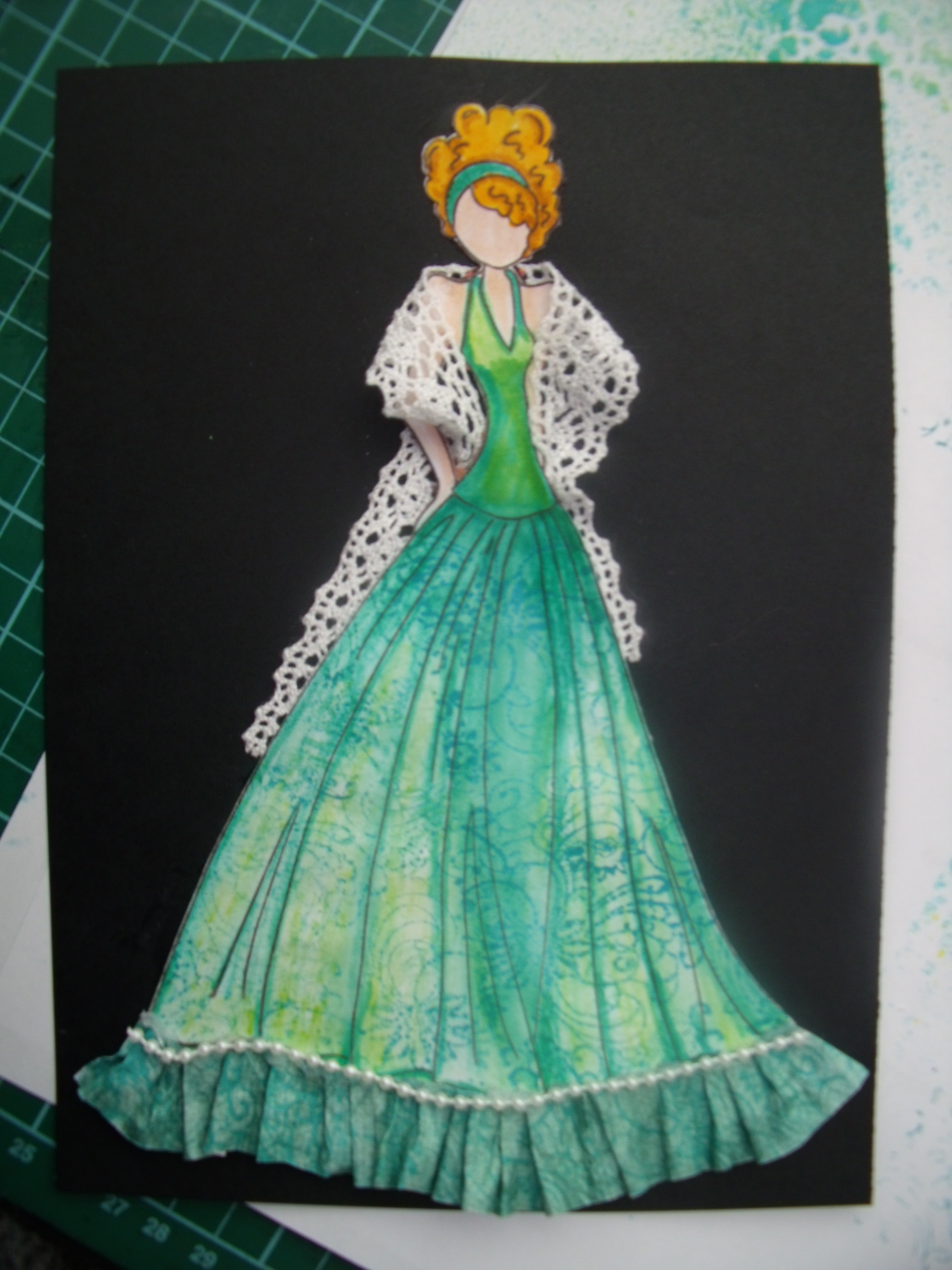
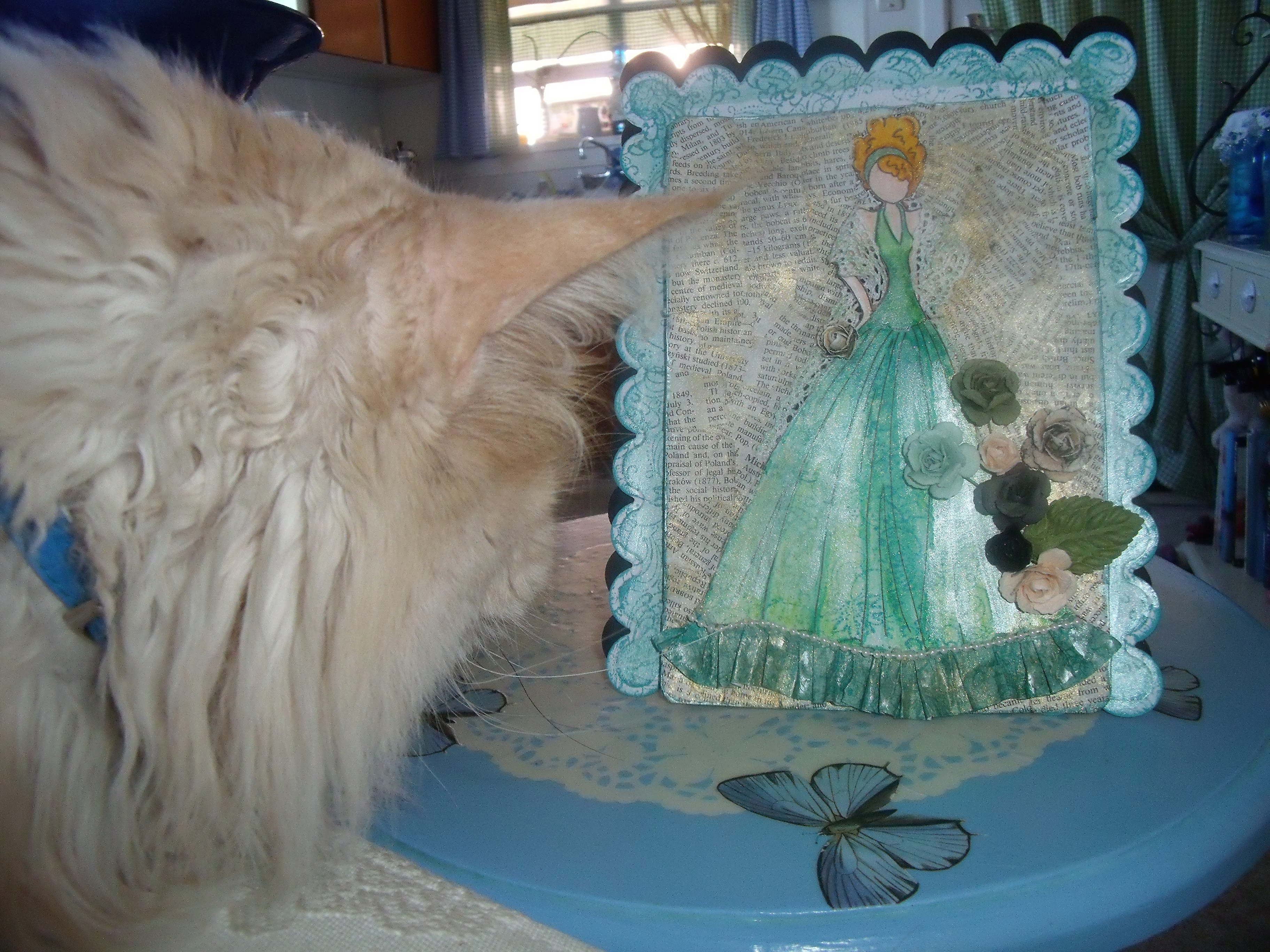
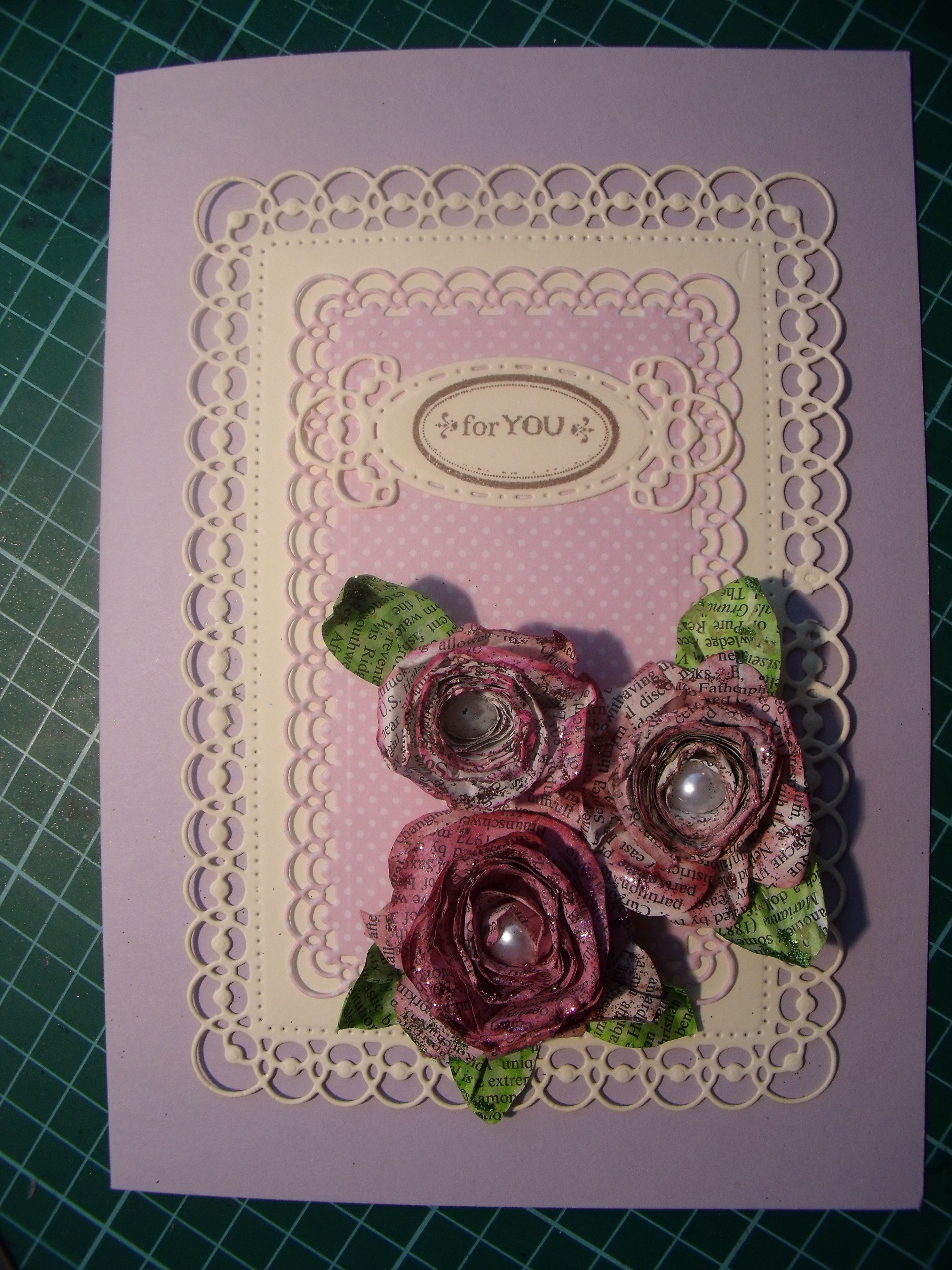
And then, because I could, I made a card, just for you!  🙂

BP flowers card best

As you can see from the photo, it’s dark and past my bed time.  Orlando has already gone…………

So, wherever you are in the world, I wish you a good night – or a good day!!

In bed

Any questions, please do ask ’em.

Thanks for dropping by, love that you did!