In conversation recently it was noted that I’ve been using blue greens quite a lot as that appears to be my latest colour crush.
Totally, I agreed, any colour associated with the sea seems to be my thing at the moment.
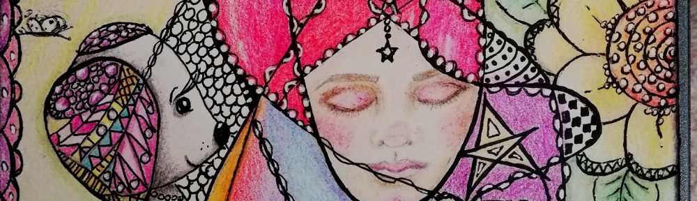
The conversation took an unexpected turn when it was mentioned that orange is a colour never seen in my work. On quick reflection I had to agree, it is never seen….. I didn’t even have an orange paint tube, though I do own a Distress Ink that is orange and it mostly sits unused at the bottom of the pile.
It was wondered if I use much of any of the hues from that portion of the colour wheel – the yellows through reds.
I use yellow quite often I said. A quick hunt through current work and then photos of past work proved the point, I use yellow with blue very often and make lovely greens with them.
I use red I said. By golly yes I do, a little is to be found in most paintings. Whew!!
So I set out to do a painting that didn’t feature any sea type colours and did feature yellow and orange. I even purchased a tube of orange paint!
As I worked I found the colour palette quite heavy [surprisingly – orange should be light and refreshing like it’s name] so I started to add in white which made a huge difference and when I had another of my genius ideas and used the edge of a rectangular paper doily as a frill on the bottom of her dress then things began to pop.
I had no idea what I was going to do when I started and was over halfway through before I could see where we were going – and this is what emerged:
![A Gardener [c]](https://thecontentedcrafter.com/wp-content/uploads/2013/12/a-gardener-c.jpg)
Half successful only, I couldn’t help myself the background just had to be what it is 🙂
I wish I’d chosen a longer canvas to work on so she could have been full length instead of cut off, but that’s what happens when you don’t have a plan!
As I was making the flowers, I found I was thinking of my blogging friend Alys over at Gardening Nirvana and the words just popped into my head.
So what is your opinion of my attempt to use orange?
Thanks for coming by today, I love that you did! 🙂


