Joy

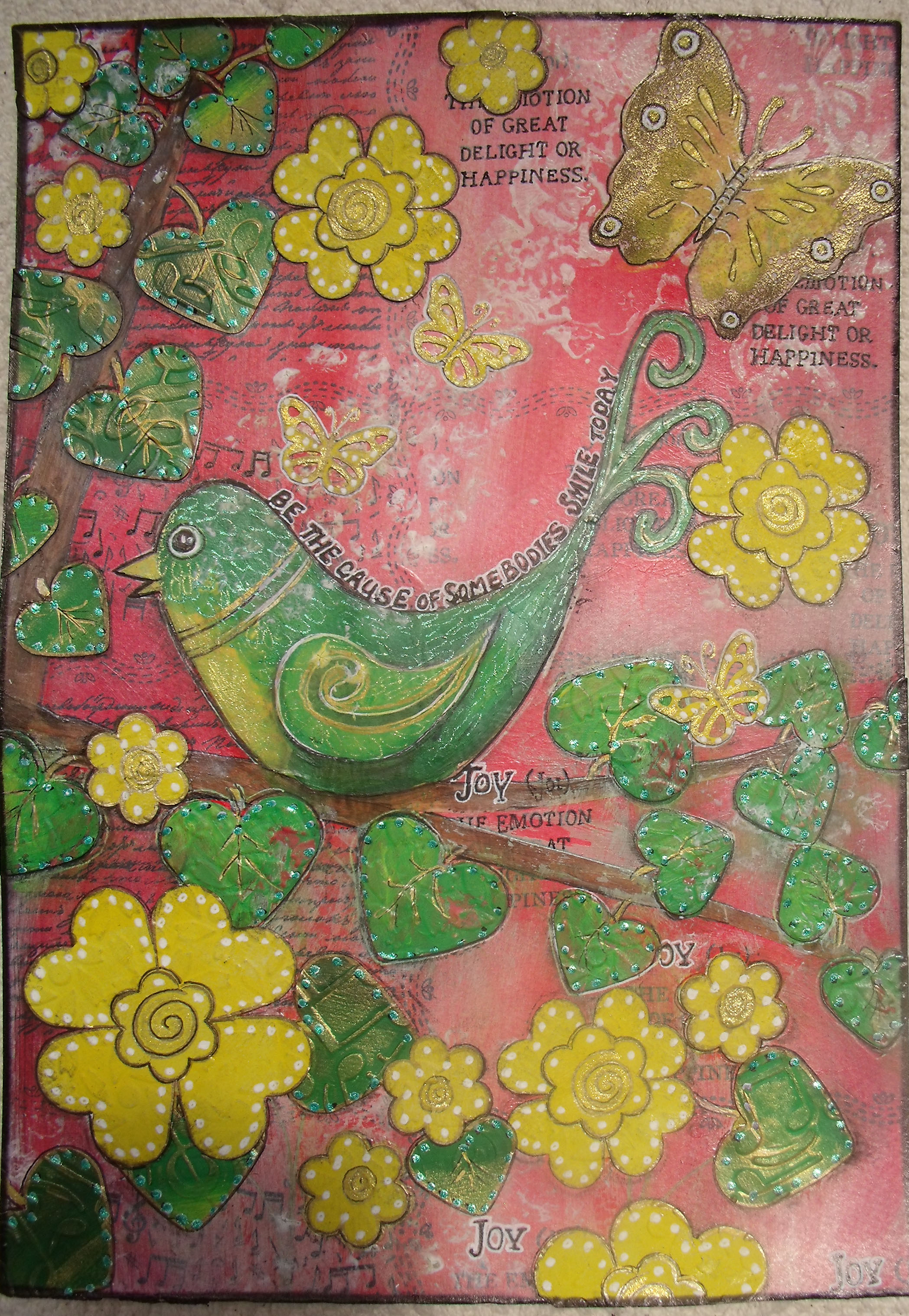
I’ve been working on this piece for several days – it started as one thing and, as so often happens, morphed into another.

I am determined to continue in my practise of using colours that are not common to my palette – it’s good for me to stretch my wings…  This one started off with red and orange, which should be fine as they are side by side on the colour wheel –  but when the green came along that simply didn’t work so I morphed the orange into yellow in an attempt to lift the image.

Zing!!

I have developed a decided love/hate relationship with it!

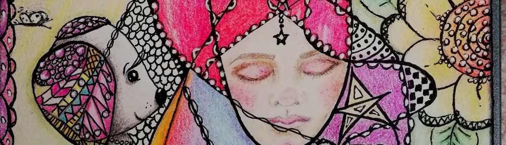
I love my little birdie, I hate the composition!  It’s messy and crowded and the bird is in the wrong place …………  I really need to develop a plan of action before I start drawing and painting and gluing random bits down ……. so much to learn!! 🙂

And it’s an awful photo – there is so much sparkle and texture that it seems to be impossible for the camera to get its act together.  That shadow in the lower left corner is I believe my head.  The floor of the conservatory is the best place to take photos – the sun was shining and it was close to midday……… Sigh!

I’m sounding decidedly grumpy to my own ears –  but I’m not really – maybe the combination of red, yellow and green doesn’t agree with me – though it is decidedly summery 🙂

I shall get it scanned and see what I think about it then – maybe it might make a nice card….. or it may just end up in the art archives folder

Bird2

Click on the image to get a bigger view, click again for detailed viewing.

Mixed media collage on  A4 300gsm art paper.

Acrylic paint, papers, stamps, paint pen, gel pens, charcoal, pitt pens, gold metallic pen and Inca Gold paint.  Heart punch by Sullivans and butterfly punch by Martha Stewart.

The original layer is two shades of red and some white acrylic paint.  When dry I stamped with three different stamps and applied gesso through a template randomly.  A third coat of thinned white paint was applied and wiped away while still wet to grunge it up a bit.

The bird was drawn freehand on lunch-wrap paper [deli paper to some of you], painted and then fussy cut and glued down to the substrate using gel medium.  I stuck her down too far to the left.

The tree branches were also made originally on deli paper and attached to the substrate.

The flowers and leaves were all made from  200gsm paper which was painted and then dry embossed and punched out in two sizes using heart punches. When they were assembled and attached to the substrate I went in with pens and pencils and paints and gussied them up some.

When everything was in place I used charcoal and pitt pens to define edges and bring it all together.

What do you think?

When you look at it do you feel joy?  Or do you, like me, sigh and think  – oh, that could have been so nice!  🙂

Onwards ans upwards!!

Thanks for coming by today, I love that you did!  🙂

Box To Book – Part 4: The Cover

Welcome, if you are a new reader [or follower 🙂  ] here is a brief introduction to this project:

Last Christmas I received a Grand Calibur die cutting machine which came in a large and sturdy box which – in a moment of madness – I decided to turn into a book.  There are three previous posts showing the progress I was making – I haven’t made much progress for a while really………….

****************************************

So I hit a wall – I was thinking too much and everything I did was awful – truly awful!!

A good lesson for me to learn – stop thinking and start creating!

I got into the rut because I really wanted to make something special out of that box – the idea is to return the box to the original giver in a new form, so therefore I couldn’t muck it up………….. and, of course, therefore I thought too much and mucked it up ….. !!!

So I had a wee paddy and went into the play room today saying through gritted teeth – just go with your gut and play and chuck out all the ‘shoulds’.

And a miracle happened and in just a few hours I made the cover for the book:

I took some cream card stock and painstakingly put it through the machine six times to get the embossed pattern into it.  I used stains in ‘Aged Mahogany’ and ‘Brick Red’ to colour it and when it was dry I sprayed liberally with glimmer mist ‘Black Cherry’ to get a slightly worn, but rich red.  [NB:- The photos were taken with the low winter sun streaming onto the desk, the colour is not quite this pink in reality]

Day 7 Cover 1

Then I prepared the inside lining for the cover.  The small paper example to the right is the original, to the left after it is sprayed with the same glimmer mist colour.  The edges are stained and slightly tattered:

Day 7 Cover Inside 1a

When I had made two boards – front and back covers – I left them to dry and played around with the glimmer mist on some lace and punched a length of pretty paper using a Martha Stewart punch:

Day 7 Cover 2

I decided it looked a bit insipid, so it too got sprayed liberally with the glimmer mist!

I cut a strip of grunge paper to size and that got a good coat of ‘Aged Mahogany’ stain and came out really pretty – it looks and feels like velvet!  Then I attached the dyed lace with a light coat of multi-medium.

Day 7 Cover 4 Spine

There was a strip of the inside paper lying around so I decided to use that on the front cover too, everything was glued on seperately and layered carefully.

Finally I attached the outer spine using a combination of hidden staples and tacky glue and then – fittingly – left it sitting under the weighty die cutting machine – the item which came in  the original box – to dry:

Day 7 Cover 5 Drying

When it emerged from under the machine it looked like this:

Day 7 Cover 6

I’ve started on the title and a little something else which is needed – and I’ve got a line of pearl beads to attach tomorrow –  but the worst of it is done.  What a relief!

I’m really happy as at last it is starting to look the way I wanted it to – like a really old book that was beautifully and carefully hand made and has been much used and is now just a little the worse for wear ……

Thanks for sticking with it – let me know what you think………..