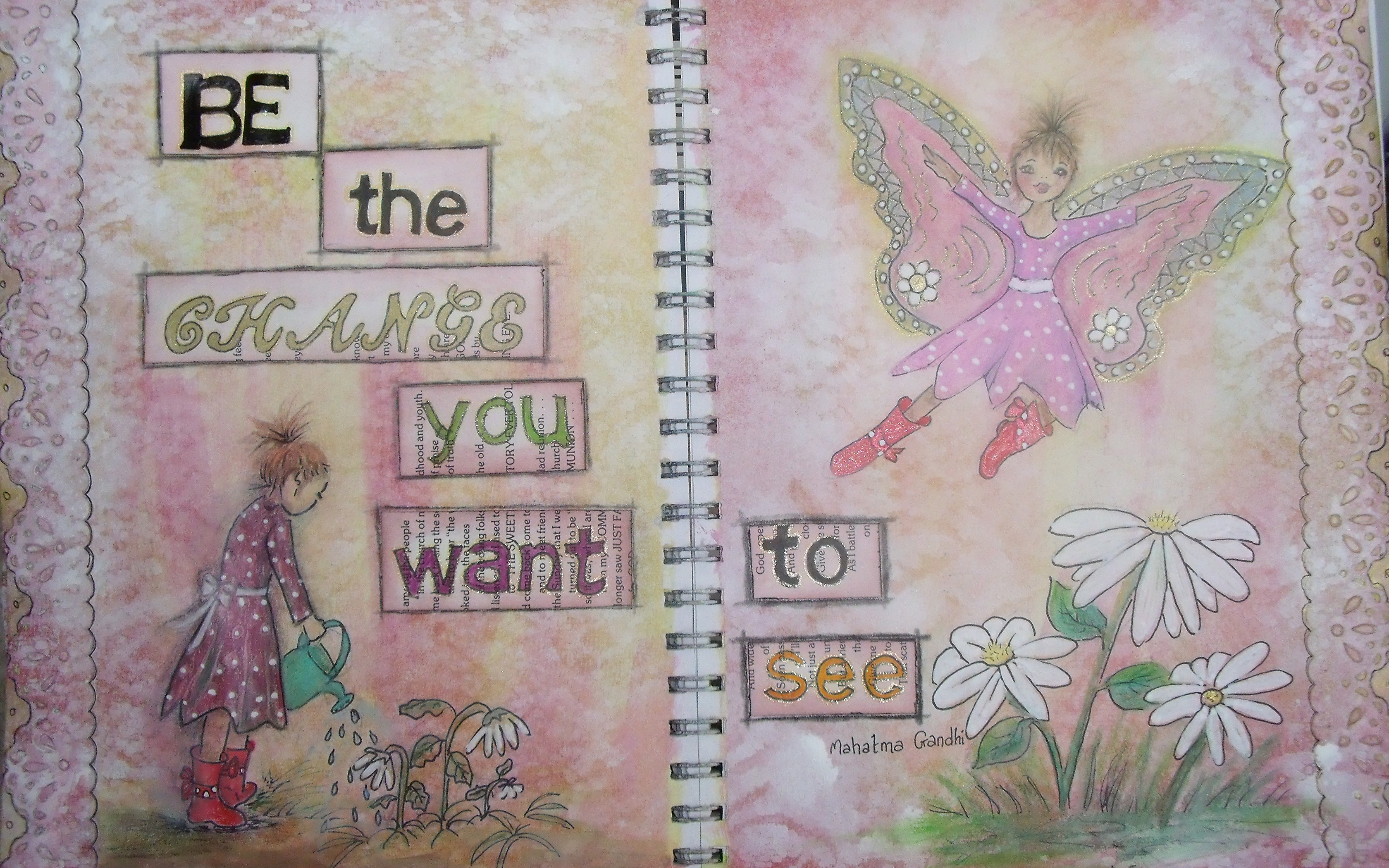
Be A Butterfly

Hello my lovelies!

I have been quite busy this past week – I took a leap of faith and decided to go for the Etsy shop thing – sooner than I had originally thought I might.  This decision was in no small way brought about due to the ongoing encouragement and support from my blogging pals – none of whom I personally know, but all of whom I feel I really know!

I cannot say enough about those of you who consistently visit and leave comments and words of encouragement.  I work mostly in isolation and your feedback has been pivotal in keeping me on task and determined to grow as an artist [chuckle – it still makes me smile…]

So to those loving, caring, loyal, helpful, beautiful gals – big, big hugs, tons of love and an unspeakable amount of gratitude zipping out from here to you!!

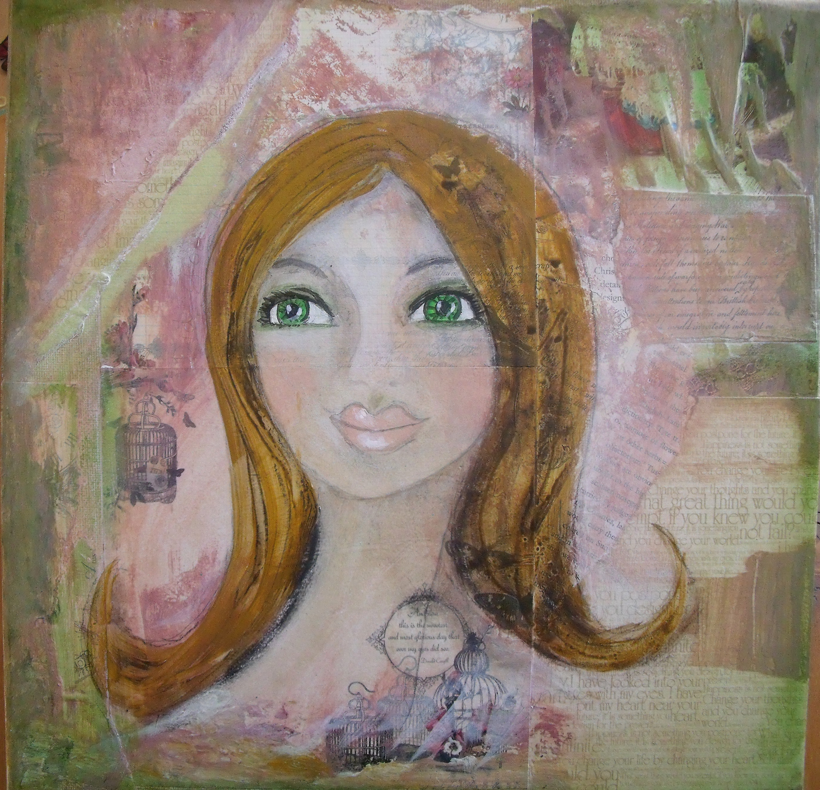
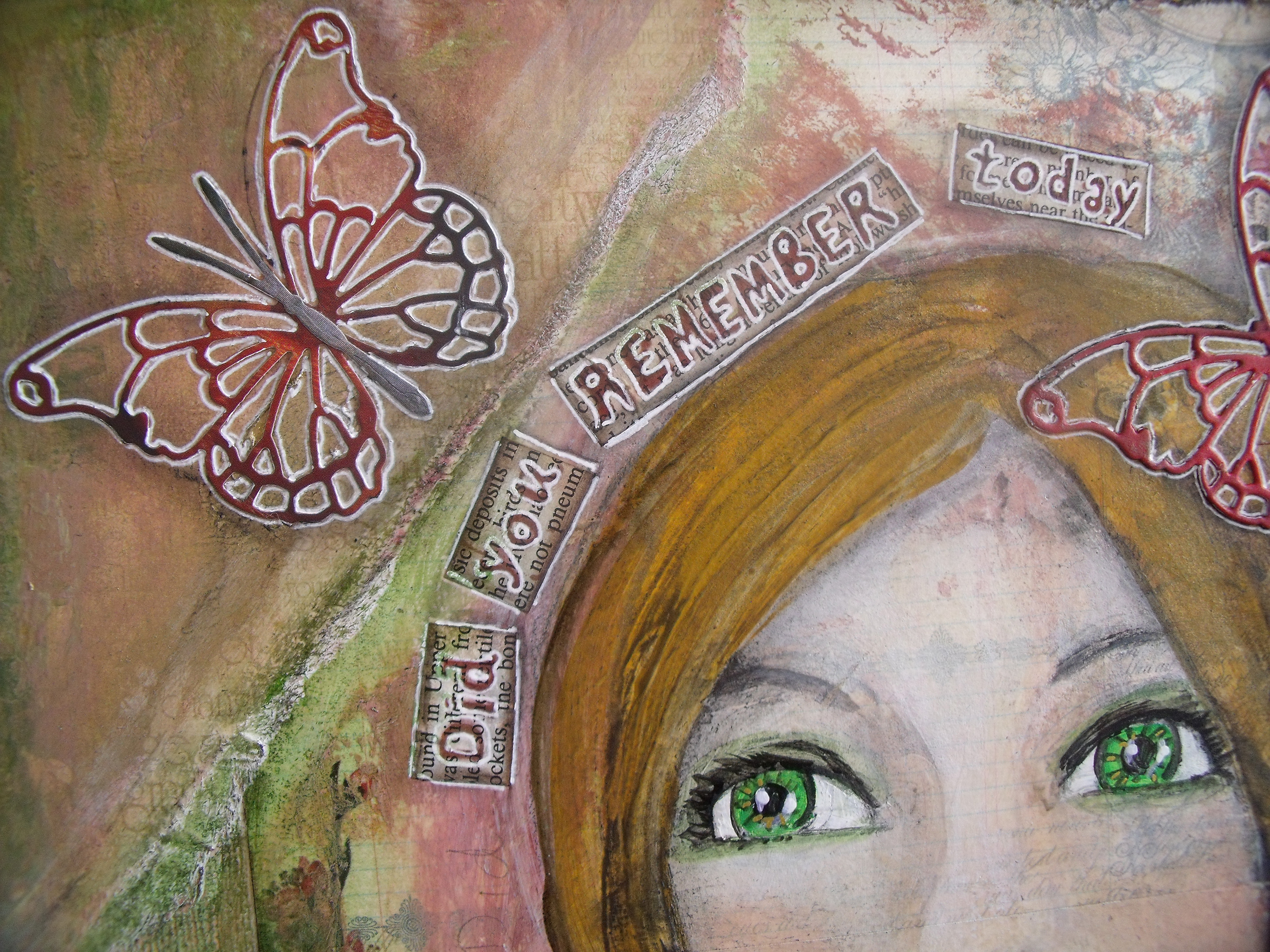
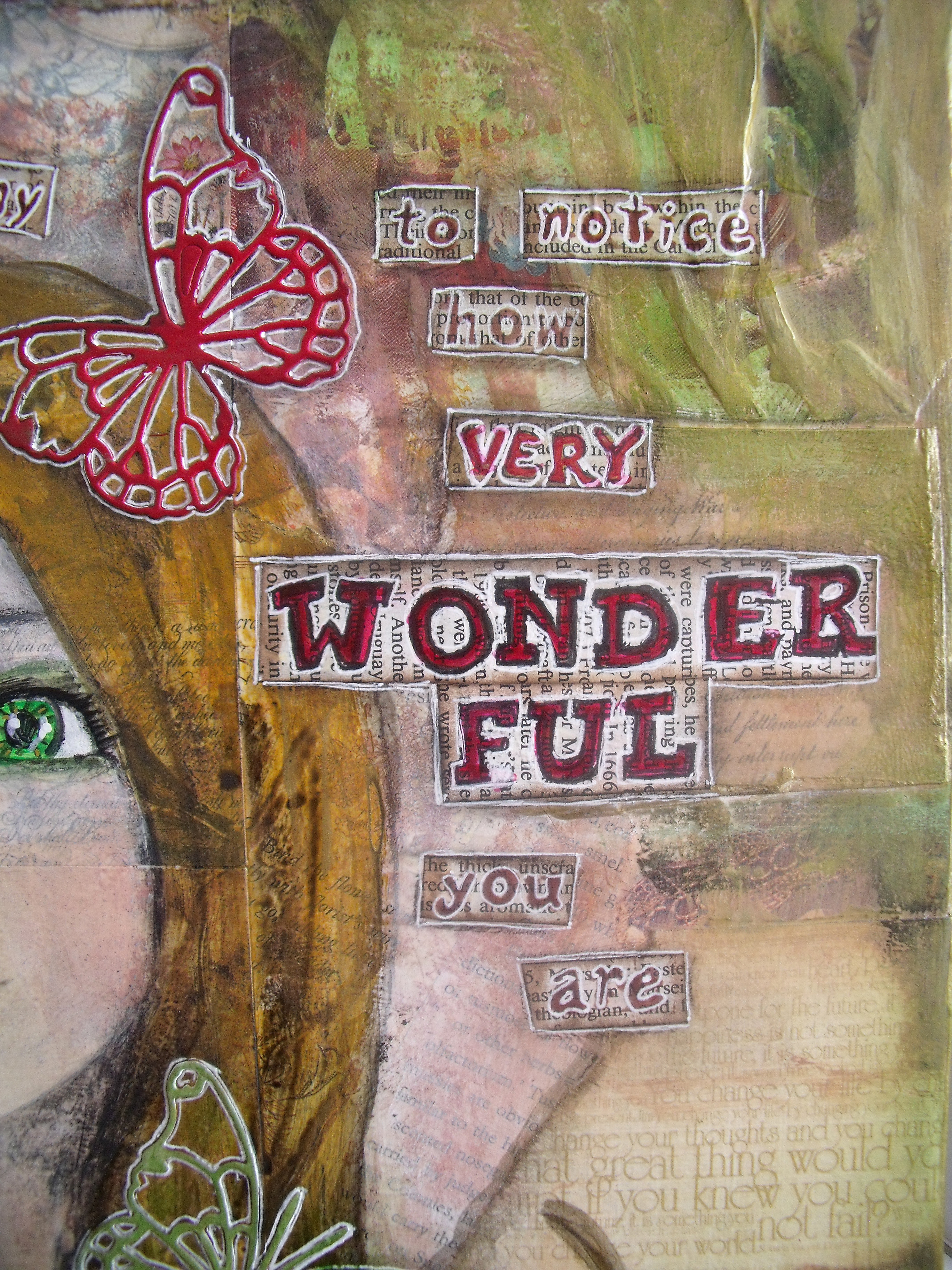
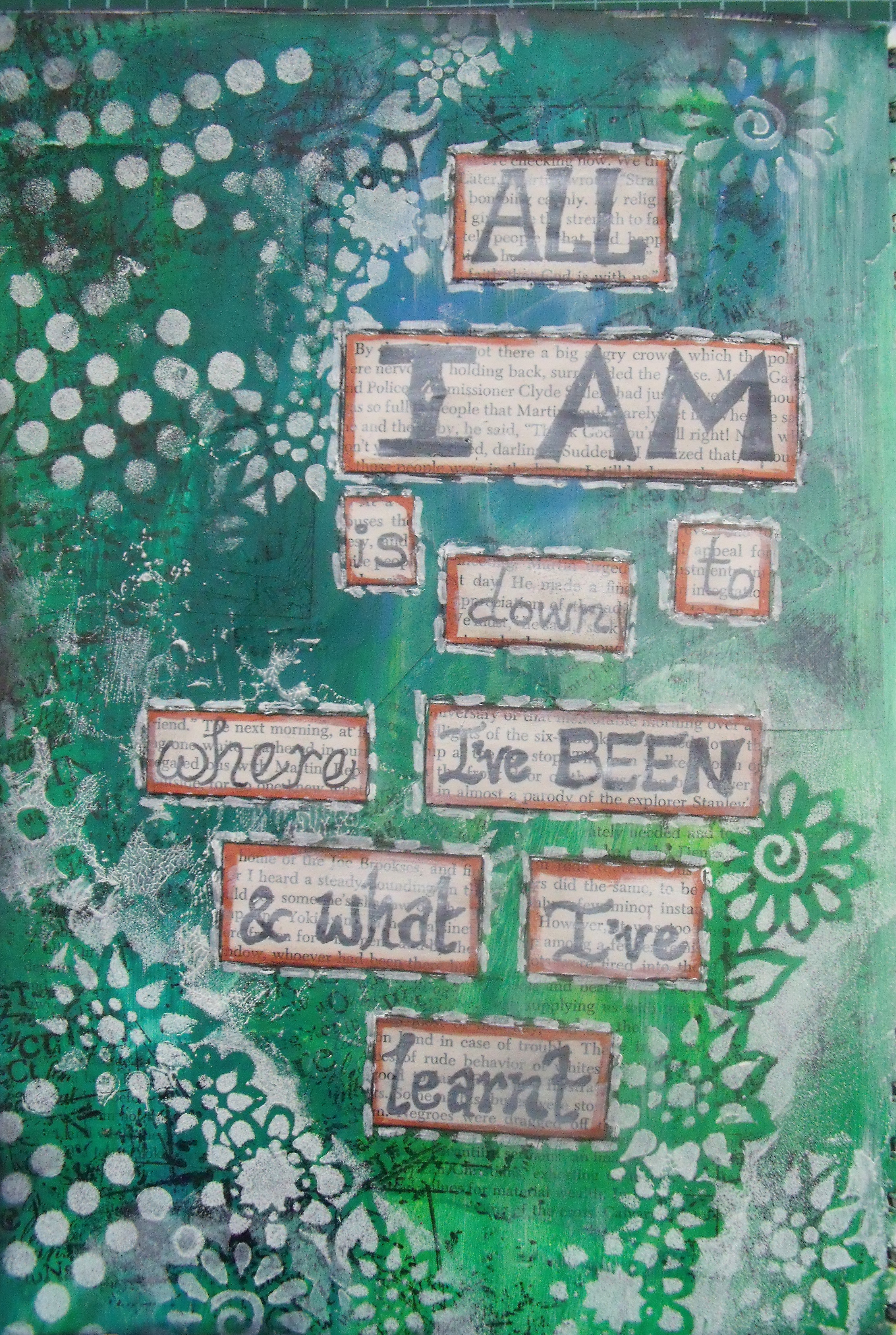
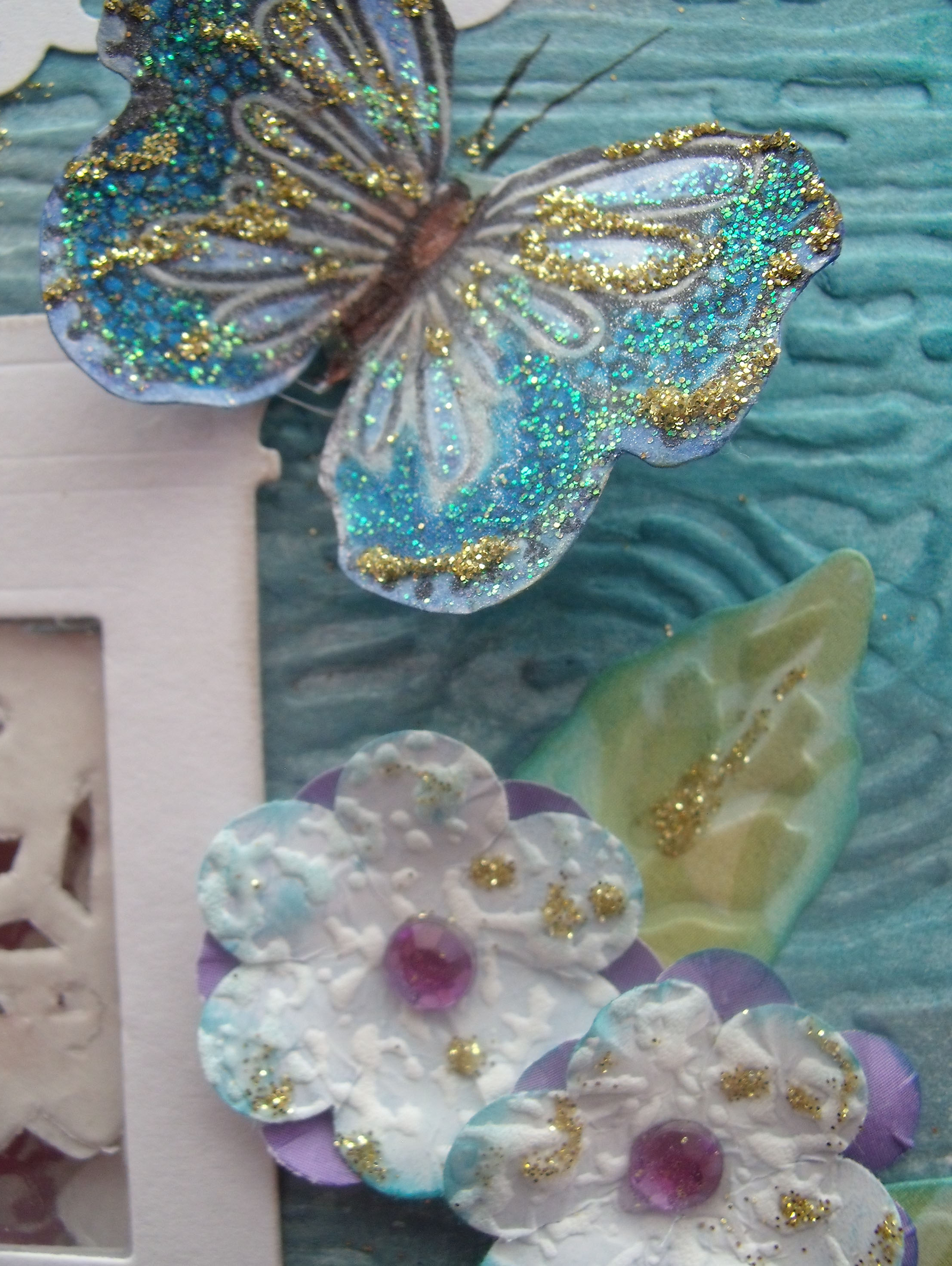
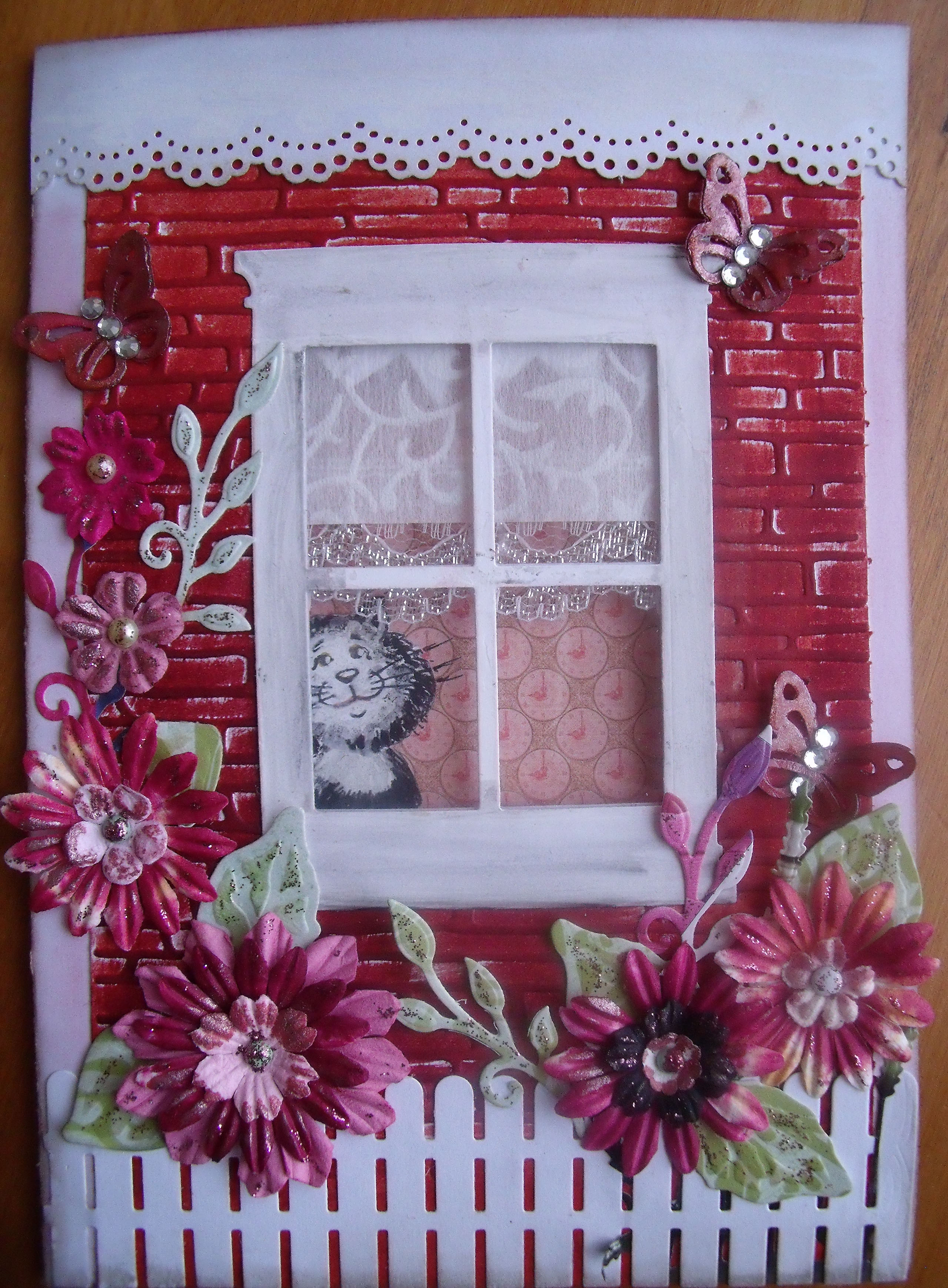
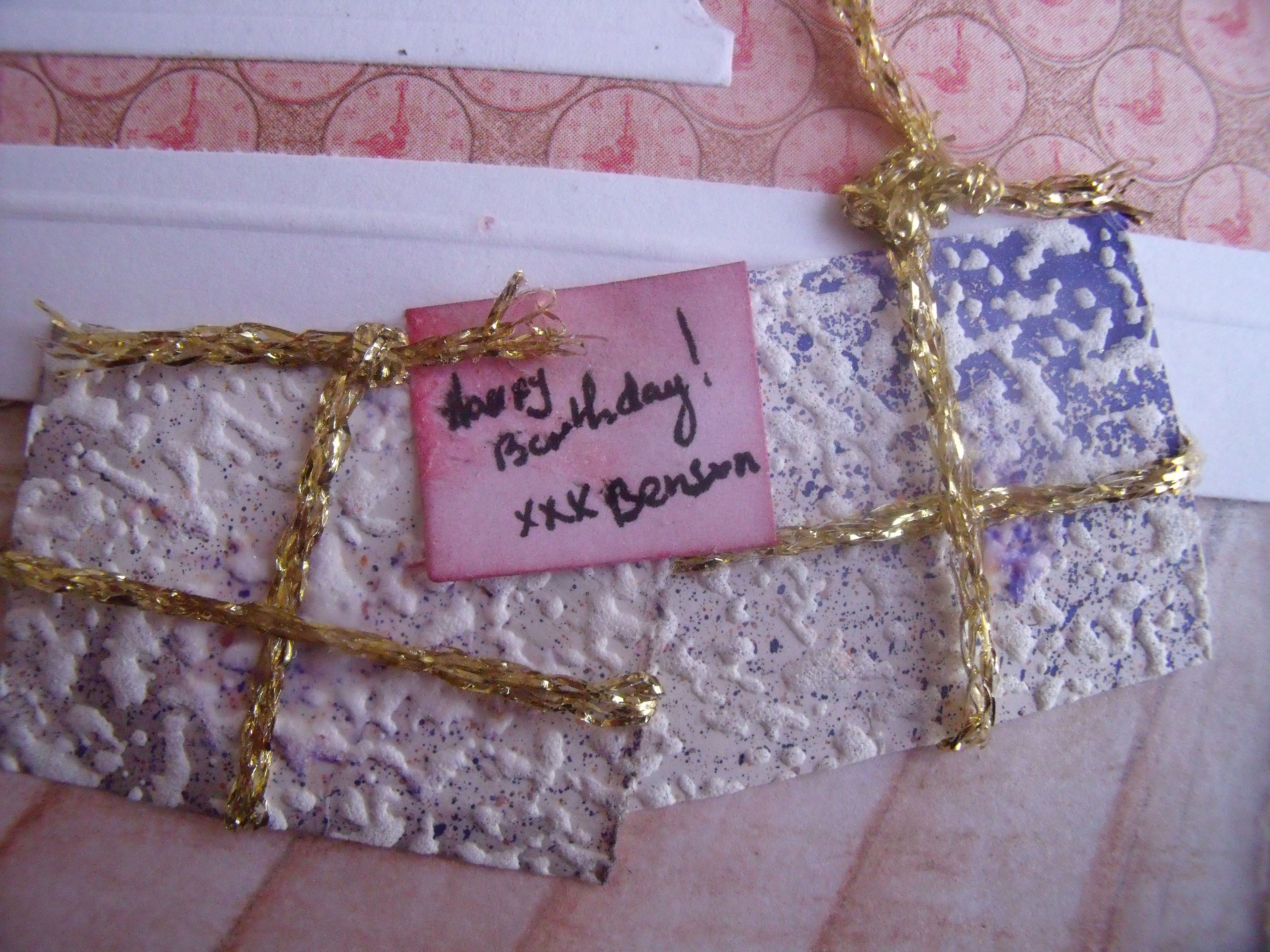
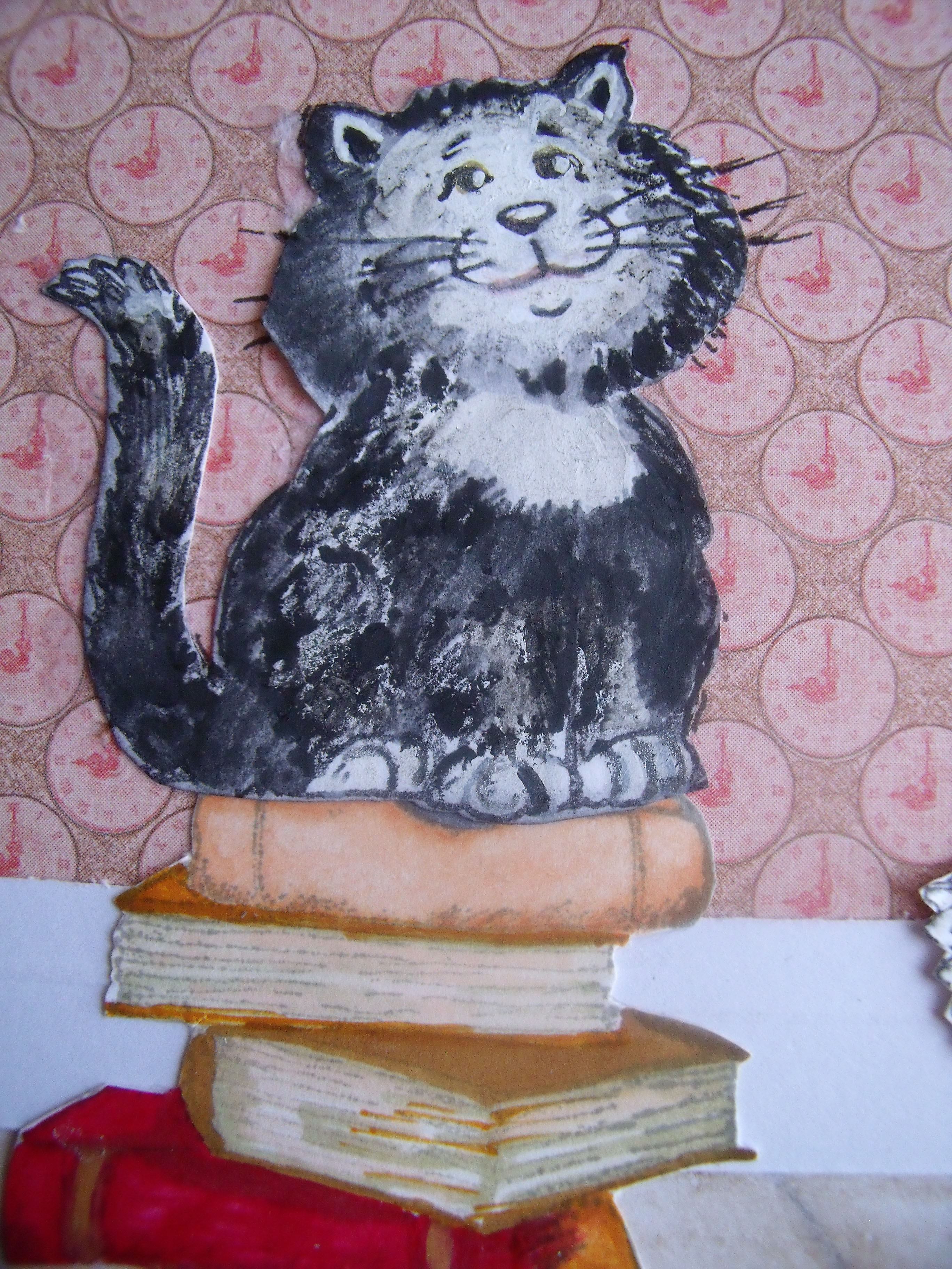
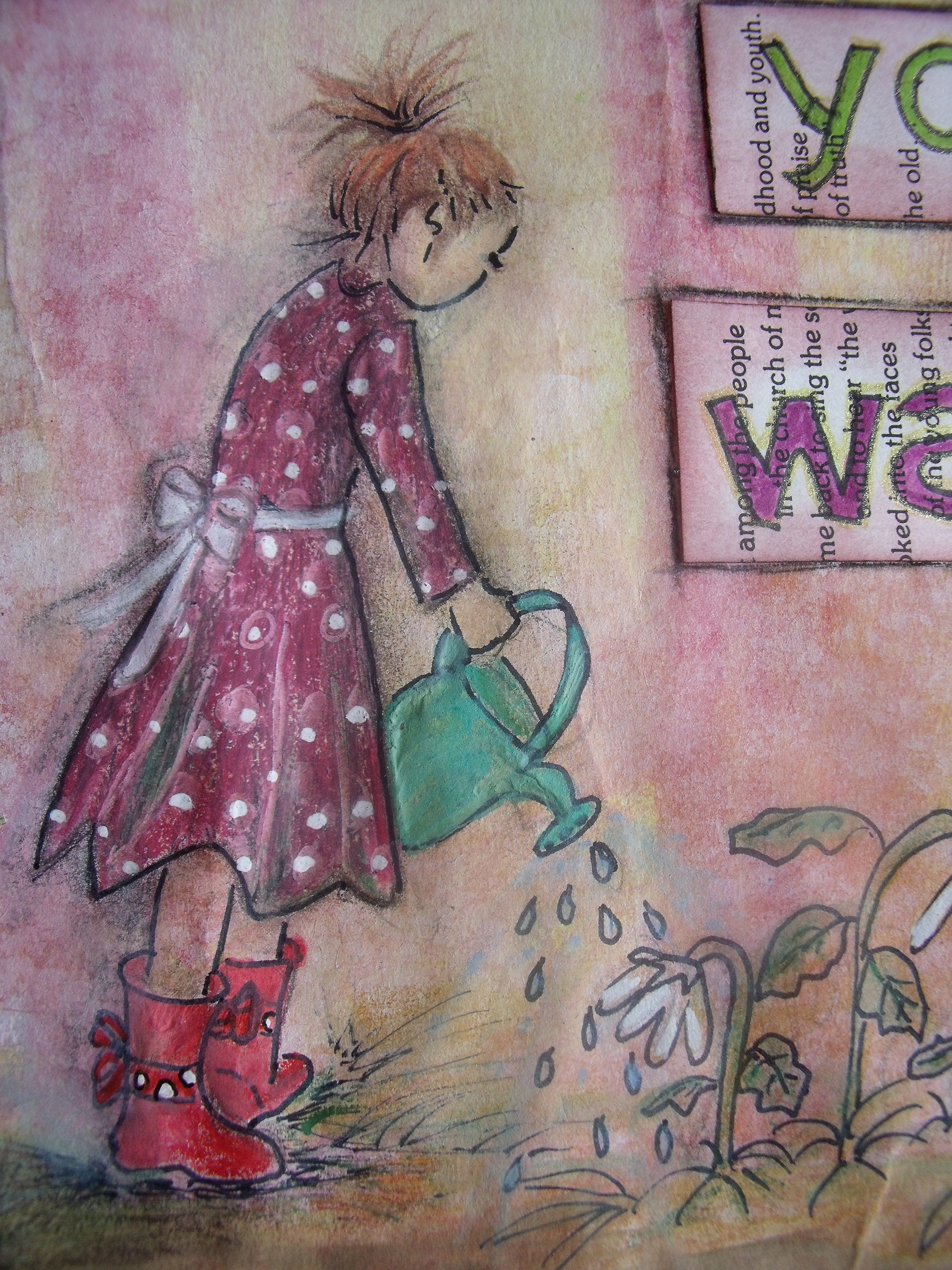
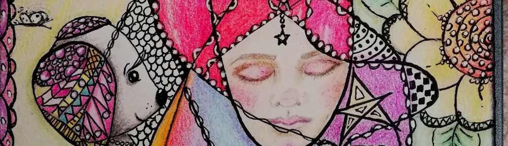
To celebrate the opening of said shop ‘The Contented Crafter’ – of course, what else – I painted a small mixed media canvas featuring a faery girl and butterflies.  She will be the first original mixed media canvas in the shop:

BeAButterfly1

This is a smallish exhibition canvas – just under 20 cm square x 3.5 cm deep [8 x 8 x 11/2″]  Worked in acrylics with water and ink pens, stamps and glitter. [You’ve gotta have some bling!]

There will also be larger limited edition prints and blank all purpose greeting cards of this faery girl in my Etsy shop.

To celebrate the opening of my new creative venture I am giving away the first numbered and signed limited edition print of this canvas to a randomly chosen commentor on this post.  You have until the 13th to comment.

The draw will take place on the 14th November, which is also the same day The Contented Crafter Etsy shop will go live   🙂   [Ooooh, exciting!]

All commenters names will be written on slips of paper and placed in a randomly selected kitchen container and the winner’s name will then be selected by someone who is not me.

So dear readers, I hope you like her and want to take a punt.  🙂

Mixed Media Canvas

After two weeks of making flowers and cards and occasionally battling with my first canvas in over six years – WE HAVE LIFT OFF!

The first big breakthrough came when I could finally admit I had bitten off more than I could chew and that it actually was okay to walk away from it ……..  that took ten days to get to.

I had rashly committed to a canvas measuring 600 x 500 mm [23 1/2 x 19 1/2″]  – it seemed quite small at the time considering that I routinely painted on 1000 x 800 mm back in the day….

What I was not considering was that I had changed mediums and styles – I used to work with acrylics and the odd bit of charcoal and pen and create giant imaginary land and seascapes – this would be my first canvas as a ‘multi-medium artist’  [Oh, giggle – it makes me so happy to think I might be an ‘artist’….  🙂 ]  Up until now when mixing my mediums, I had worked in my journal and on card size pieces only.

Having purchased and read Kelly Rae Roberts marvalous book ‘Taking Flight‘ and having checked out Willowing [Tamara Laporte’s] work on You Tube, I felt ready to give this thing a proper go……

Yesterday I got out a small canvas 300mm sq [11 1/2″] and set about collaging in the background.  I used mostly ‘Websters Pages’ and added in some text from old books.

I painted over the whole thing with a brayer, removed some colour and added green distress inks around the edges of the torn pages and the edge of the canvas.

I sketched in the face and coloured it lightly with some distress inks:

Did you remember1

…..and went to bed.

This morning I worked on it some more:

Did you remember2

My confidence grew as I avoided all the idiotic pitfalls I could have fallen into and I didn’t screw up too badly….

So of course I kept at it- adding in Lumiere ‘True Gold’ around the sides of the canvas and pulling it into the front of the canvas as opportunity presented itself.  I highlighted raised bits and edges of torn paper too.  And if a little is good, more is better – right?  I added gold highlights to her hair so it glimmers in the light – too much?

Finally I edged and highlighted with black charcoal:

Do you remember3

Time to stop – so, of course, I kept going….

I added in the legend for that special someone and then the butterflies.

Here is the finished canvas:

Didyouremember4best

I’ve chopped 2 – 3 cm off the top of the canvas somehow when taking the photo….. but you get the idea.

And some detail photos:

Didyourememberdetail5

Didyourememberdetail4

Did you remember detail2

That’s my first Christmas gift made and it is still October – well for another 24 hours anyway ….. onwards and upwards!

Thank you so much for coming by today – I love that you did!  🙂

Cards with Faux Metal Flowers

The painting is not going well, the lap top is still temperamental and the weather is changeable – it being spring and all – and I have not posted for ten days!

The desk top is buried under a pile of papers and inks and paints and heavens only knows what and I end up working in that little 10 cm square empty spot in the middle:

Image

Now before continuing with my tale I must just fill you in a little more.   I am an enthusiastic fan of Vivian Keh, whose blog ‘Contadina K’ is peppered with beautiful and inspiring work and who often makes videos to share her talent.  [If you are a card maker and haven’t, you should check her out]

Vivian has been making gorgeous cards [check ’em out here] which kind of inspired me to get out my embossing folders and play around a bit with them – I can’t remember why precisely, but something was kicked off in me and I left her blog and wandered off to the play room and hauled ’em out ……….  I didn’t document the process, but all that work can be seen as the background to what comes next……….

On with the story.

If you are a long time reader of this blog you will know that when things are not going well in the arty-farty part of my life I make flowers.

So, I’ve also been making flowers.

This time I played with water soluble pastels and pastel gliders [which are similar to Faber Castell Gelatos] only with a more affordable price point  🙂   I randomly splotched colours all over some 160gms water colour paper and then spread them about with a very wet paintbrush.

See those chopped up bits of paper lower left of the photo, that’s all that is left of those lovely colourful papers I created.

I die cut as many flower and leaf dies as I could fit onto each piece of paper and got a wildly varied collection of colours and patterns – some look really interesting and pretty:

Image

Others not so much:

Image

Some colour ways just did not sit well with the cards I had already begun to prepare for them – using the embossed backgrounds remember – so I got out the ‘Twinking H20’s’ and started playing around to see what happened.

What happened was that as I layered the different colours I began to get a metallic look.

This was exciting and interesting so I forged ahead and made these:

Image

The card on the right is not finished – it is still waiting to be flowered up, but here you can see one of the embossed backgrounds I’ve been wittering on about.  The other two are already tucked away safely in their cellophane bags, maybe not so very clear, but you get the idea – yes?  And those beautiful backgrounds are really my favourites – more about how they were made a bit later.

Here is the latest card I made, not yet bagged up so let’s have a closer look at it:

Image

I make these cards as durable as I can.  They are made from A4 200gsm card and the inside back is given the same matting format as the front which makes it sturdier and able to support the weight of the card front.  Here is what the inside looks like:

FFCard12

Lots of space to write your message!

Closeups to show the faux metal look:

Image

FFCard11 Metal

I think the above photo shows best the metallic look – the leaves look weighty and see, even the tiny butterfly has a metallic look.

In real life they all  do really and truly look as if they are made from metal  – this morning I actually had a tinge of disappointment when I picked up a metal looking butterfly [made using the smallest Martha Stewart butterfly punch] and it had no weight to it – and I made the darn thing!

Here’s another flower with a copper look to it:

FFCard9

Once the H20’s have dried I run a darker ink around the edges and some raised parts of the flower and leaves, which gives a more finished look to each piece I think.

FFCard10

This card also has my favourite background – remember those first two cards, here is how they were made.  I used two Spellbinders ‘Impressabilities’ – this one called ‘Diamond and Stars’ and the one used at the top of this post called ‘Butterflies’ – as templates and inked through them with three to four different coloured chalk inks.  I think the colours are soft and pretty and they work well –   Yay, successful backgrounds.  🙂

So that’s what I’ve been up to the past week or so – just playing around to see what happens………………

What do you think?

Thanks for coming by today, I love that you did 🙂

All I Am – Another Art Journal Page

Orlando the Marmalade Cat has been the star of the show for the last three posts, I decided it must be my turn again!  And today I decided to work in my art journal again – I haven’t since September 14th [Be the Change …….]  My how time flies!!

All I knew when I started was that I wanted to work with my new Monte Marte acrylics, which I’ve had since the end of August and still hadn’t opened.  They are beautiful – rich, thick and creamy and as you will see, with a fabulous depth of colour.

I started by laying down some old book pages, which I gessoed over and then I painted.

When the paint was dry I used a couple of acrylic stamps – one with scratchy marks on it and one with words – and randomly plonked them around the pages.  Finally a small Dyan Reavelly stencil came into play and I used a dry sponge with almost no gesso on it to dab out the spots and flowers.

With the background done I sketched the head outline in pencil then painted the area white.  Once that was dry I could settle in and let the features begin to reveal themselves.

I had three colours on my palette for the face and added in some metallic bronze for the hair – in real life when the light hits the page the hair sparkles 🙂

By the time I had finished painting her the words were clearly in my mind, so I wrote them out onto book paper, cut them out and stuck them in before I could change my mind.

AllIAm1a

Close-ups for you:

AllIAm2

AllIAm3

Couple of detail shots:

AllIAm4

AllIAm6

I love my new paints!

Thanks for coming by today, I love that you did!  🙂

More Gift Bags

When my lap top started playing up I retaliated by leaving it alone to sulk and put all the extra time I found I suddenly had into solving the mystery of making gift bags.

The original batch were posted about here

Once the mystery is solved you can get creative – but not without inspiration from others!

I remembered having seen a picture on Pinterest of some newsprint bags with doilies, and I set about making my own version.  Here they are all waiting about on the other work bench for whatever happens to them next:

Gift Bags 5

They are so pretty!

The doilies are cut from the die that you can see in one of the open storage cases in my previous post on storing dies.

You know how I love to re-purpose items?  In solving the problem of how to keep the bags closed I came up with the somewhat ingenious idea of using bobby pins – decorated and be-ribboned ………. which, of course, then becomes an added extra for the gift inside.  [Smiles smugly to self!]

With the trials all completed I set about making up the original order [remember YD asked for some for her Christmas packaging]

Here they are

Gift BagsD1

Close-up – so pretty!

GiftBagsD3

I imagine that when I get my gift on Christmas morning it will maybe look like this:

GiftBagsD5

By then I will have forgotten about them and may well say something like – ‘Oooh, that’s a pretty bag!’  [Don’t judge – it will probably happen just like that!]

And when I look inside the bag I will find this:

GiftBagsD6

Oooh, so excited!  I wonder what will be inside that tiny box……..?

🙂

Well, that’s the gift bag saga done and dusted – now I really must get back to the art journal!

Thanks for dropping by today – love that you did!

Storing Dies – Solving a Paper Crafter’s Dilemma

I love dies!  They are a great tool, but there are so many on the market you can go bonkers and end up with a storage dilemma!

I  use lots of Spellbinders and I love the dies that Memory Box, Poppy Stamp, Couture Creations and My Favorite Things put out.  I have some Sizzix too, but not many.  I find the size and thickness of those other Tim Holtz dies too problematic to store, so though I have a couple I no longer buy them.

The dies I do buy are thin.  They may be thin, but they are weighty.

When I first starting using dies, about six or seven years ago now,  I kept them in their packets in a small box.  I kept buying more dies [all paper crafters know it is addictive!] and they graduated to a large shoe box or two, where they got all muddled up and I spent more time hunting for what I wanted then actually die-cutting.

About two years ago they found themselves being fitted onto magnetic sheets and being stored in a purpose built plastic case.  Which the growing number of them soon out-grew. This solution was also problematic – the cases are pricey and the specially shaped magnetic sheets are also pricey.  The cases hold a finite amount of dies and do not hold the larger ones at all [Spellbinders ‘Grands’ for example.]

Their next home was an apartment building of 3 hard cover large ring binders, still attached to their magnetic sheets and each sheet individually encased in a plastic sleeve.

That seemed to work better than any of the previous scenarios, but the weight of the combined dies in each folder made for two problems.

1: hoisting the folders down from their storage shelf and back up again [I’m short and leaning over the work bench and reaching up to the shelf with weighty things can be fraught in a crowded working space – if you drop a folder it breaks stuff!]

2: the weight was tearing the plastic sheets away from the binding holes, making the folders unstable and searching for items more difficult.

There was still also the issue of searching through weighty pages of dies to find the one I was looking for.

Then a couple of weeks ago someone in my local Freecycle group advertised 30 new, empty DVD cases to give away.

I was on the phone like a shot!

When I got to the house to collect the cases the lovely man asked me how many I wanted.  “All of them” I said – meaning ‘all thirty.’ and explained what I wanted to do with them.  He swooped up two boxes and carried them to the car.  When I got home I discovered I had ninety new, empty DVD cases.

Ninety!

Here’s a shot of about forty of them:

Die Storage 2

All beautifully and tidily lined up, labelled and categorised.   Every Virgo’s dream  🙂

Some of the fronts even have a picture of the contents, others just a list.

Die Storage 5

Open one up and take your pick – this is a selection of my favourite embellishment type dies::

Die Storage 3

This is a Sizzix set of stamps and dies – most recently used in the making of the ‘Box to Book’ project:

Die Storage 4


No more hunting through pages of heavy dies – now a quick peruse down the spines and Hola!  there is the one I want to use!

Die Storage 1

I love my little mannequin posed there – he ever so slightly reminds me of C-3PO out of Star Wars ….. Perhaps I should paint him – is it silver or gold, I can’t remember – what do you think?

There is now one remaining large folder housing the  aforementioned ‘Grand’s’ and a couple of extra long lace edge dies from Couture Creations.  Not a problem with just six pages to sort through.

The remaining DVD cases are now being utilised to store acrylic and unmounted rubber stamps – still in progress.

And there we are my friends, one less dilemma in the creative space   🙂  It is working really well and is encouraging me to use my dies more often as they are so easily accessible!

Thanks for dropping by today, I love that you did!

Another Card For Kerry!

Hello there!

ED looked at the previous post, ‘A Card For Kerry’ – “It’s very nice,” she said “but it’s supposed to be blues and purples…”

Nothing happened inside my head indicating information previously given and momentarily forgotten – nope, just a big black hole.  “Oh!” I responded helpfully……….. I always have a slight feeling of panic when this happens – as it seems to do so with alarming regularity – am I losing it – already?

But no, I just wasn’t fully present and some information just went in one ear and out the other – I’m not dotty, I’m just becoming an air-head!

As it happened, I was hoping to for the opportunity to make another, similar card  – and here was that very opportunity.  Quite serendipitous really [this appears to be the word of the week].  Now, do you suppose I did the wrong colour deliberately ……?

Any how, I wanted to make a variation on the theme, using the same techniques I would utilise if I was creating a similar lay-out in my art journal.

I didn’t document the process this time – you’ve seen it once and any way I was much too involved with the creation of this little world to stop and get the camera out.

Here is the front of the card – it is so full of layers and textures that the camera doesn’t always pick up so I’ve included some detail shots.  The house is not brick this time – the reverse of my embossing folder does a wood effect – so we have a blue wooden house 🙂

The Contented Crafter

Blue House Card – front

Not everything has been hand created this time, some of the flowers are from my stash and may be Petaloo or Prima – apologies, I can’t quite remember.  The larger blue and purple flowers are cut from coloured card stock, inked and layered up.  The very small punched flowers, and the strip along the top of the card, are courtesy of some old inked and sprayed wallpaper that has lived in my stash for years.  The ‘glass’ in the window is recycled rigid plastic packaging.

Blue House - detail

Blue House Card – detail

Blue House - detail

Blue House Card – detail

Right at the end, when everything was finished, I went back in and sprinkled a bit of glitter around – just for a wee touch of sparkle – the reality isn’t quite as glumpy as this close-up shot of the butterfly would have you believe …..

Blue House - detail

Blue House Card – detail

And here is the inside:

Inside the Blue House Card

Inside the Blue House Card

The cut-out shapes have been finished with water soluble charcoal shadowing; the side table was some left over exterior wall [wooden this time] as is the lamp – and the book spines on the table ….. no waste!  The floor rug is also a piece of the same coloured wallpaper that contributed to the small punched flowers on the front..

The chair is a Poppy Stamp die and stamp, which has been coloured with Spectrum Noir alcohol ink pens, as has the girl and cat.  The banner is once again made from the discards when the windows are die cut.

The mirror is made from a lightly textured silver paper glued to a slightly larger piece of hand cut black card and has a coat of ‘Glossy Accents’ painted over it.  The mirror frame is made from the same paper but has some ‘Crackle Accents’ over it and a light rubbing of ‘Pumice Stone’ Distress ink to finish.

Inside - right

Blue House Card, inside – right

The window blind and side drapes are cut from paper doilies, another stash inhabitant for many years – I’m not that thrilled with them, must have another try at some stage…….

Inside - left

Blue House Card, inside – left

Blue House Card - inside detail

Blue House Card – inside detail

Blue House - inside detail

Blue House Card – inside detail

And finally, because there is no room inside to write a nice Birthday Greeting to the recipient – the back of the card:

Blue10 back

I hope you enjoyed that little visit to the Blue House!  I just hope I’ve got the colours right this time!

Thanks for coming by today, I am always happy to know you have been 🙂

A Card For Kerry

Hi all!

You may remember this card – I made it for my ED’s birthday back in March

B'day Card front March 13

ED’s sister-in-law liked it very much and has asked that I make something similar for her.

I had the camera sitting on my desk, so pretty much was able to document the process step by step – ergo if you want to know how I make a card, read on! 🙂

I used 2 A4 pieces of white card stock,  one folded in half made the card base, the second went to the die machine and was put to work making all the add ons.  I think all the dies I used – with one exception –  are Memory Box dies and I also used a Martha Stewart punch.

The Contented Crafter

The Contented Crafter

I embossed the house wall with my brick embossing folder than rubbed three different shades of reddy-browns in Tim Holtz stains over it.  The die cut window was treated to some white acrylic paint and grey ink to shabby it up.

That done, I turned my attention to the inside.  Wallpaper was added to both sides of the card and another window frame was fitted with some recycled plastic packaging fitted between the two frames to serve as glass, so we have a proper window:

The Contented Crafter

The Contented Crafter

Next the architraves and floorboards were created.  I used a Couture Creations Die at the top:

The Contented Crafter

The Contented Crafter

I coloured the floor boards with water colour pencils and am really happy with the result!

Yay water colour pencils!

The next step was to create the cat and the girl – Benson and Kerry:

The Contented Crafter

The Contented Crafter

They were stamped onto white card stock and coloured with alcohol ink pens:

The Contented Crafter

The Contented Crafter

Then they were cut out – to you non-crafters this is called ‘fussy cutting’ and takes forever

The Contented Crafter

The Contented Crafter

This is where I discovered I’d made an error with my calculations – the window was too far above the floor and the cat couldn’t see out the window – some creative thinking was called for:

The Contented Crafter

The Contented Crafter

Puss sits on top of the pile of books so he can see out the window:

The Contented Crafter

The Contented Crafter

I made the flower garden and forgot to photograph that process too – sorry!

Now we are getting to the finishing touches – ‘So, what’s all this for?’ you ask:

‘Well,’ I respond ‘You remember when I cut out the window from a die?  Where the panes of glass go there are little square discards of white card.  When cut in half they are just the right size for some banners….”

The Contented Crafter

The Contented Crafter

The Contented Crafter

The Contented Crafter

The Contented Crafter

The Contented Crafter

Did you spot the window blind?  Forgot to photograph that being made – and the presents?

All ready to go!

Here is the finished front:

The Contented Crafter

The Contented Crafter

And finally, a few close ups for those of you who want a better look:

The Contented Crafter

The Contented Crafter

The Contented Crafter

The Contented Crafter

The Contented Crafter

The Contented Crafter

The Contented Crafter

The Contented Crafter

If I ever make another one I think I’ll put a table in, with a cake or some flowers on – or a chair – the room looks a little bare to me ……

I hope you enjoyed that walk through my card making process.

Thanks for dropping by today and I hope you are having a great week!

Go well!

Be The Change …….

Hello friends!  If you have been following my posts you know that I have been busy taking a few courses and learning lots……. Yesterday was the day when I decided it was time to return to my journal and create a page just for me, by me and without following anybody else’s guide lines.

Happily, I discovered I had a few more tricks in my bag!

It was time to create a page using one of my favourite quotes; Gandhi’s ‘Be the change you want to see in the world’.  It’s an exhortation to stop blaming, stop whining, stop waiting for someone else to fix things and get on and do what you can do yourself ……

I started the double page spread with three colour washes – yellow, green and red.  The colours were watered down 1:3 sploshed over and left to dry.

Next I die-cut a double run of lace from my couture creations die in white card stock and lay a length to the left and right side of the double page spread, inked it up with some ‘Aged Mahogany’ Distress Ink, glued it down and left that to dry.

 An hour later I lay a piece of old lace curtain over the pages and spritzed a good coat of Dylusions white over everything.  Peeling back the the lace revealed a rather gorgeous, soft dappled effect.

Then I got out the water colour pencils and started drawing – I wasn’t a hundred percent sure I knew what I was going to do – I had my quote and that was about it – oh and I had just found an old Fiskars template with big butterfly wings that had appealed to me – I knew I wanted to do something with that if I could …. I drew the left side first and after that the right side just kind of drew itself.

This is the water colour pencil drawing on the left side:

Image: Contented Crafter

Image: Contented Crafter

On the right hand page, the template made the outline of her wings and I drew and doodled inside the shape.  I edged the wings with a golden yellow Sakura gel pen – gotta have a little bling somewhere right?  I liked that so much that when I had the quote all written out and mounted I edged that with the same pen……… if a little bling is good, a little more is even better!

This is the water colour pencil drawing on the right side:

paulinekingblog.wordpress.com

paulinekingblog.wordpress.com

Finally the edges were treated to a light coat of gold paint, around the lace to define it a bit and top and bottom of the pages with a doodle or two, date stamped and voila, finito!

Please do note that the girl is wearing a rather fabulous pair of red gumboots [galoshes, wellingtons, rain boots – depending on where in the world you are] with a big red bow with polka dots on them, because I saw a pair in a store recently and really, really wanted to buy them despite the fact that my garden is the size of a postage stamp….. As I couldn’t justify the expense the gardening gal gets to wear them instead!

paulinekingblog.wordpress.com

paulinekingblog.wordpress.com

paulinekingblog.wordpress.com

paulinekingblog.wordpress.com

So, this is my latest page – what do you think?

paulinekingblog.wordpress.com

paulinekingblog.wordpress.com

Thanks for dropping by today, do leave as note to say you’ve been – it’s always nice to hear from you 🙂 Have a great day!

Hope – A New Journal Page

I’ve managed to completely discombobulate myself with all my new found arty-farty techniques, new equipment and re-found mediums – shall I use the water paints or the fluid acrylics or the water soluble pastels or the water soluble crayons?   Perhaps I should just use the inks and sprays I am used to – but then why are all these pretty colours sitting on my desk smiling at me hopefully?

Shall I doodle, draw freehand or use stencils?  Shall I layer or not layer?  How will I ever become an artiste if I can’t decide which medium to use?  Is it kosher to use ’em all at once?

To add to my confusion I took a short on-line class with the remarkably talented Valerie Sjodin.  Her work is stunning and she works with accuracy and attention to detail.  Doesn’t really sound like me does it?

One aspect which was really new for me was doing the lettering first – usually I do any writing towards the end of my process and, with a blank sheet of white paper looking back at me,  I found it impossible to picture how it would look at the end – which is pretty obvious when you see the end!    It is so interesting learning different ways of working and so challenging too!

I learnt a lot but didn’t have a hope of coming anywhere near the beauty of Valerie’s work.  Standing back to assess my effort, I told Orlando despondently it wasn’t working out for me because I didn’t have the right paint colours and he just stretched up and asked for a dance.

We had a wee dance around the studio – well, to be accurate, I do the dancing – swaying really – and he sits up in my arms, head back, eyes closed and purrs and harrumps and warbles with bliss…..

But I digress!  Here is my first effort:

Hope1vs1

All the wording comes from Valerie – I loved it so much I just went with it.  You may notice the curvy edged paper – I have made a small 8 page journal with shaped edges and a wrap around cover – also courtesy Valerie.  When the whole thing is finished I’ll put it up for your admiration and delight 🙂

But this first effort is pretty dismal!  Usually when I make a muck up I can retrieve, cover, change, somehow redeem something – but there is nothing on this page I like.  The background is flat and uninspiring and I over-doodled on the right hand edge.  The splodges of gold are an aborted attempt to stencil some leaves with gold perfect pearls – which is a brilliant thing to do provided you don’t blast them over enthusiastically with the very large water spritzer bottle picked up mistakenly because you weren’t really concentrating at that particular moment, and thusly cause them to just go glump!  

Let’s see, what else ….. I don’t like the colours I’ve put on the egg shaped words.  There should have been a gap between that egg of words and the doodled edge – and the rest of the wording is – well, just rubbish really!

But was I deterred?  Was I heck!!  Hope is my friend, so I flipped the page and had another go:

Hope2vs1

I lay down tiny bits of torn book pages and painted the background with Hansa Yellow fluid acrylics.  Those white circles are made with a bit of bubble wrap dipped into gesso and pressed onto the page.  Then I did the words   [Little rebel contented crafter 🙂 ]

I doodled the flowers and edges and felt much happier.

Here are a couple of close-ups:

Hope2vs2

Hope2vs4

All in all, much happier with version two – do you agree?

Thank you for coming by today, love that you did!