I was asked by a shop owner recently to bring in some of my work as she had heard of it and was interested in offering some for sale. She gave a glowing description of how she loves to support local artists and has several whose works move swiftly through her shop.

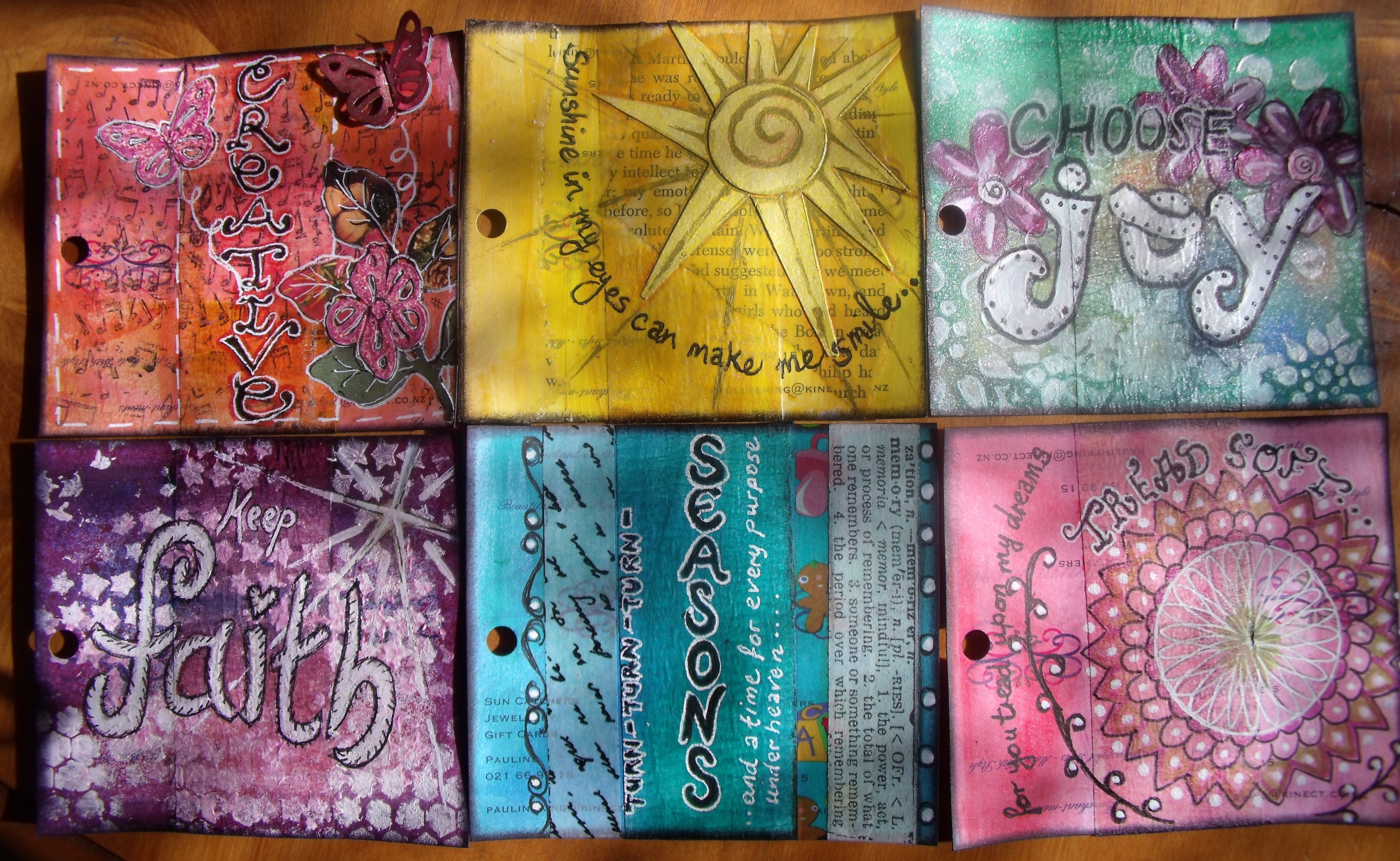
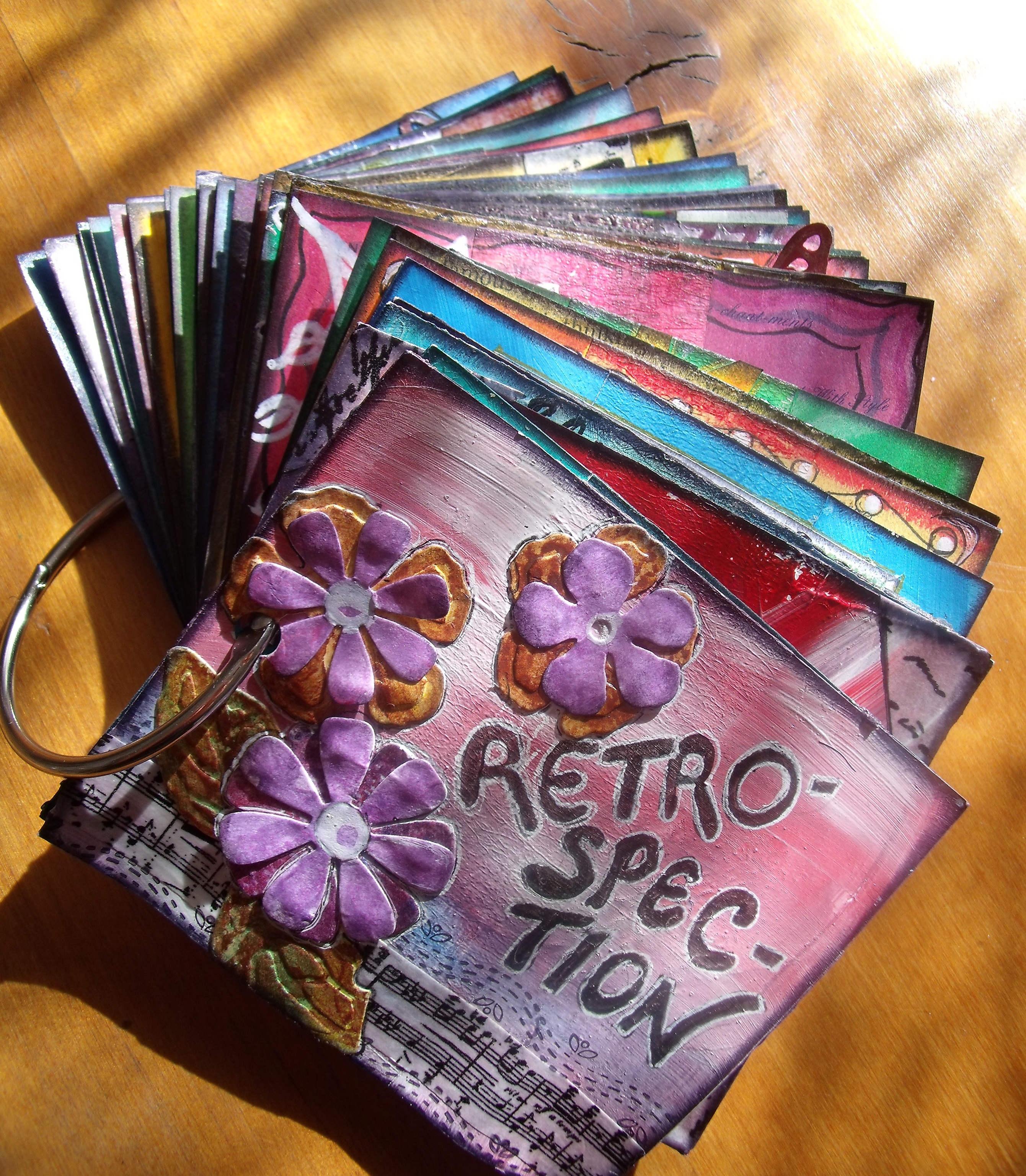
So, a few days ago, I packaged up a range of cards and small art pieces and took them in. I laid a few of the cards in front of her – leaving more cards and all of the artwork in my bag. She swept her hand through the examples and said “No, these aren’t what I sell – too vivid.”
The viewing took maybe five seconds.
I gathered up the rejected work and put them back in my bag. I didn’t offer her any more to look at and she didn’t ask to see them.

The impeccably attired, ochre clad shop owner then showed me through her little boutique, stuffed to the gunnels with imports from the UK and Asia in varying hues of beige and grey. Amongst the neutral and impeccably exhibited artifacts sat the odd single hued floral jug. Small, ochre and grey prints in large frames with exorbitant price tags hung from the wall and fine scarves in shades of grey and beige with equally exorbitant price tags were neatly folded and stacked alongside matching, finely spun woollen driving gloves. Some charmingly autumn hued cushions were stacked on a chair by the front entrance. When I asked where the work of the local artists was I was shown a few small printed ochre and brown greeting cards made by a university student.
I saw very clearly why my work wasn’t her style, but did rather wonder why she had ever shown any interest.

We are all different and that is a good thing. The world would be a boring place if we were all the same, wouldn’t it? But I left wondering what it must be like to live in a world of dun neutrals and to be unable to even consider a colourful card.
Back home, I rifled through the examples I had packaged up for her and glumly regretted my wasted morning.
It took me a few minutes, but then I remembered that not only does playing with colour make me happy, but I have Marlene (#1 Fan) and all my other friends who applaud loudly from the sidelines and now and again offer valuable feedback. Plus of course I have an unending supply of cards I can send off for birthdays, holidays and other celebrations.
I marched myself back into my art room and spent a happy couple of hours making some more highly unsuitable vividly coloured art cards. Hey ho!!

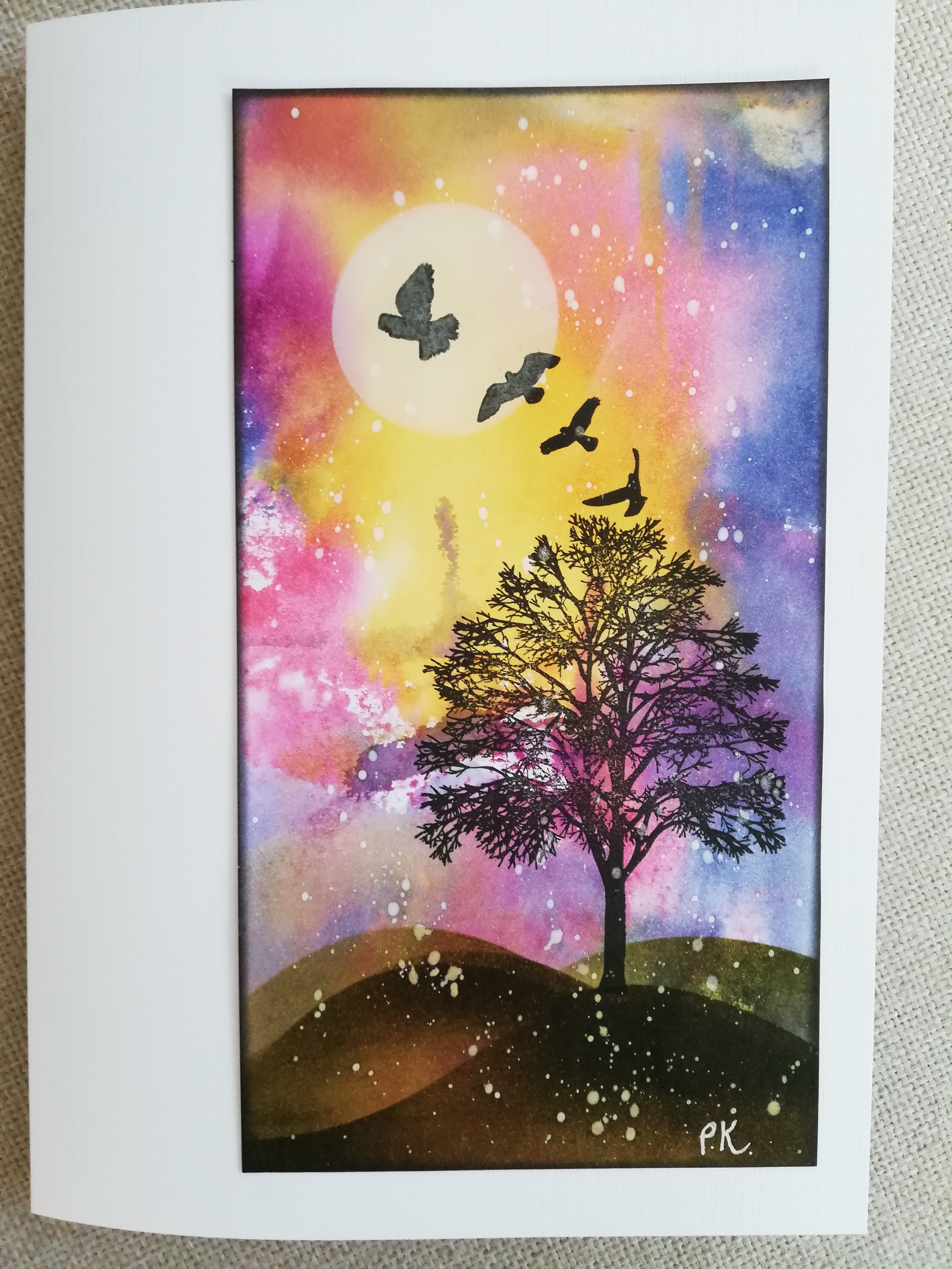
Oh well, that last one is a bit of a bust! A lot of a bust if I’m being honest. Overcrowded, overworked ….. And really! I don’t know why I decided to go doodle crazy with a white pen – but then, it was my last hurrah at the end of a long and somewhat trying day!
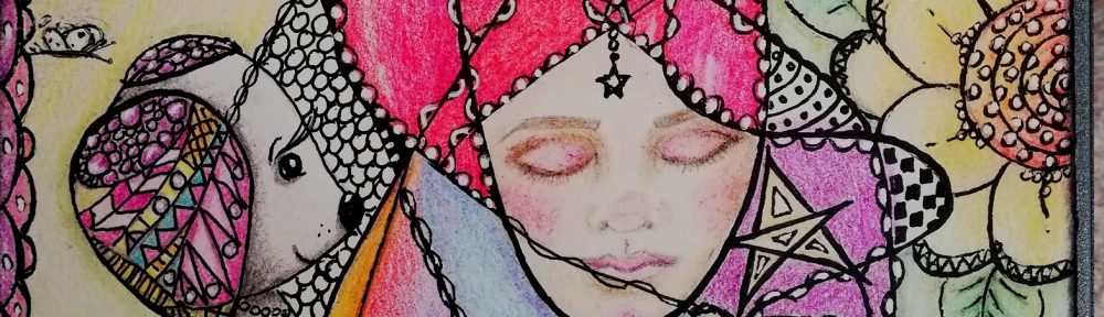
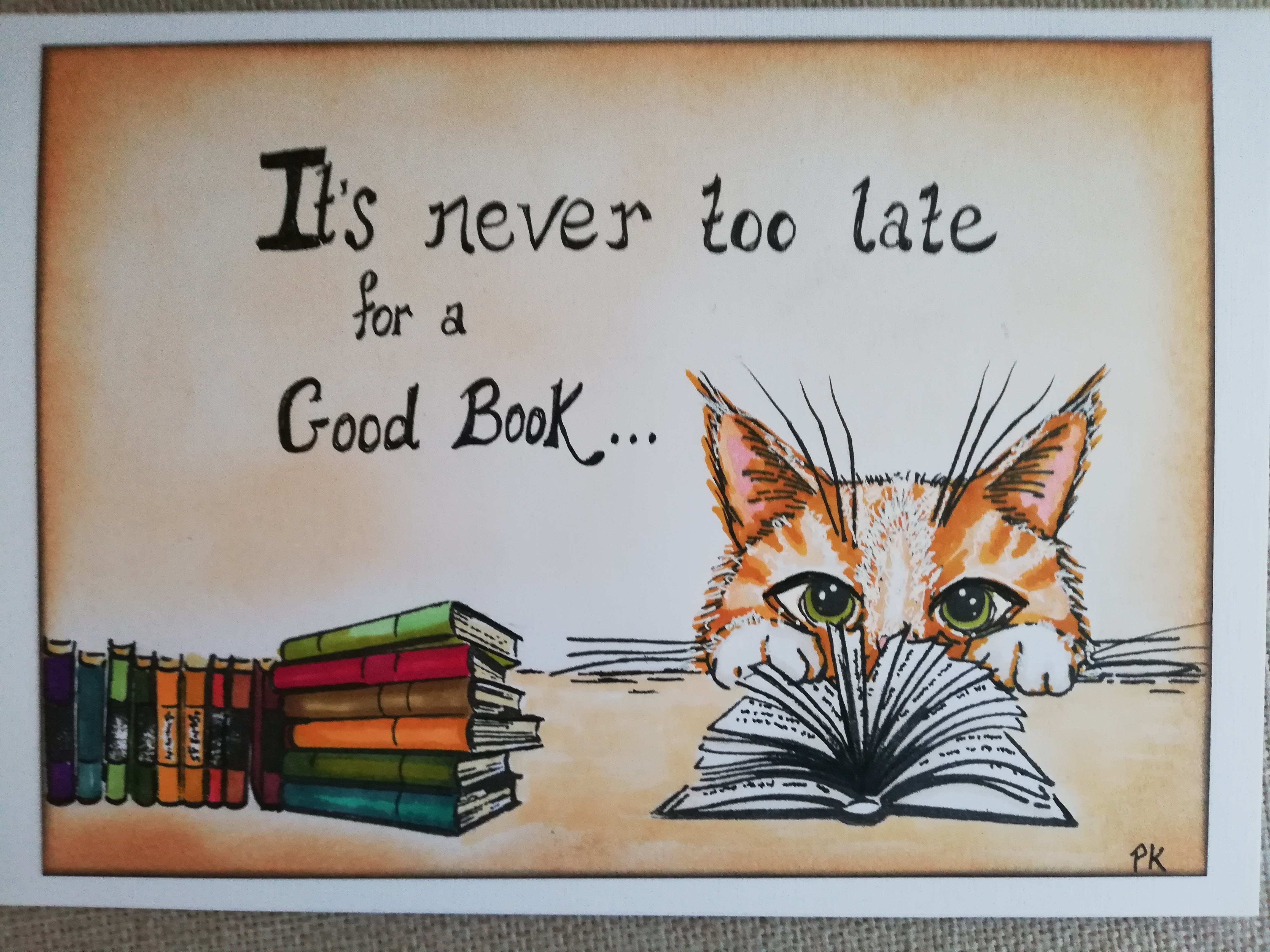
So, okay, let me leave you with this one then, today’s effort features Orlando
So tell me, when choosing cards do you look for more colour or less colour? Do you choose plain or intricate designs, are you attracted to Hallmark or local artisans work? There is no right or wrong answer and I don’t mind hearing if you don’t even like any or all what I’ve shown here – I’m just really interested in your thoughts. And thank you for sharing them!