
I was asked by a shop owner recently to bring in some of my work as she had heard of it and was interested in offering some for sale. She gave a glowing description of how she loves to support local artists and has several whose works move swiftly through her shop.
So, a few days ago, I packaged up a range of cards and small art pieces and took them in. I laid a few of the cards in front of her – leaving more cards and all of the artwork in my bag. She swept her hand through the examples and said “No, these aren’t what I sell – too vivid.”
The viewing took maybe five seconds.
I gathered up the rejected work and put them back in my bag. I didn’t offer her any more to look at and she didn’t ask to see them.

The impeccably attired, ochre clad shop owner then showed me through her little boutique, stuffed to the gunnels with imports from the UK and Asia in varying hues of beige and grey. Amongst the neutral and impeccably exhibited artifacts sat the odd single hued floral jug. Small, ochre and grey prints in large frames with exorbitant price tags hung from the wall and fine scarves in shades of grey and beige with equally exorbitant price tags were neatly folded and stacked alongside matching, finely spun woollen driving gloves. Some charmingly autumn hued cushions were stacked on a chair by the front entrance. When I asked where the work of the local artists was I was shown a few small printed ochre and brown greeting cards made by a university student.
I saw very clearly why my work wasn’t her style, but did rather wonder why she had ever shown any interest.

We are all different and that is a good thing. The world would be a boring place if we were all the same, wouldn’t it? But I left wondering what it must be like to live in a world of dun neutrals and to be unable to even consider a colourful card.
Back home, I rifled through the examples I had packaged up for her and glumly regretted my wasted morning.
It took me a few minutes, but then I remembered that not only does playing with colour make me happy, but I have Marlene (#1 Fan) and all my other friends who applaud loudly from the sidelines and now and again offer valuable feedback. Plus of course I have an unending supply of cards I can send off for birthdays, holidays and other celebrations.
I marched myself back into my art room and spent a happy couple of hours making some more highly unsuitable vividly coloured art cards. Hey ho!!
Oh well, that last one is a bit of a bust! A lot of a bust if I’m being honest. Overcrowded, overworked ….. And really! I don’t know why I decided to go doodle crazy with a white pen – but then, it was my last hurrah at the end of a long and somewhat trying day!
So, okay, let me leave you with this one then, today’s effort features Orlando

So tell me, when choosing cards do you look for more colour or less colour? Do you choose plain or intricate designs, are you attracted to Hallmark or local artisans work? There is no right or wrong answer and I don’t mind hearing if you don’t even like any or all what I’ve shown here – I’m just really interested in your thoughts. And thank you for sharing them!


I love your vivid colors and creative combinations. ❣❣
LikeLiked by 2 people
Thank you Jan 🙂
LikeLike
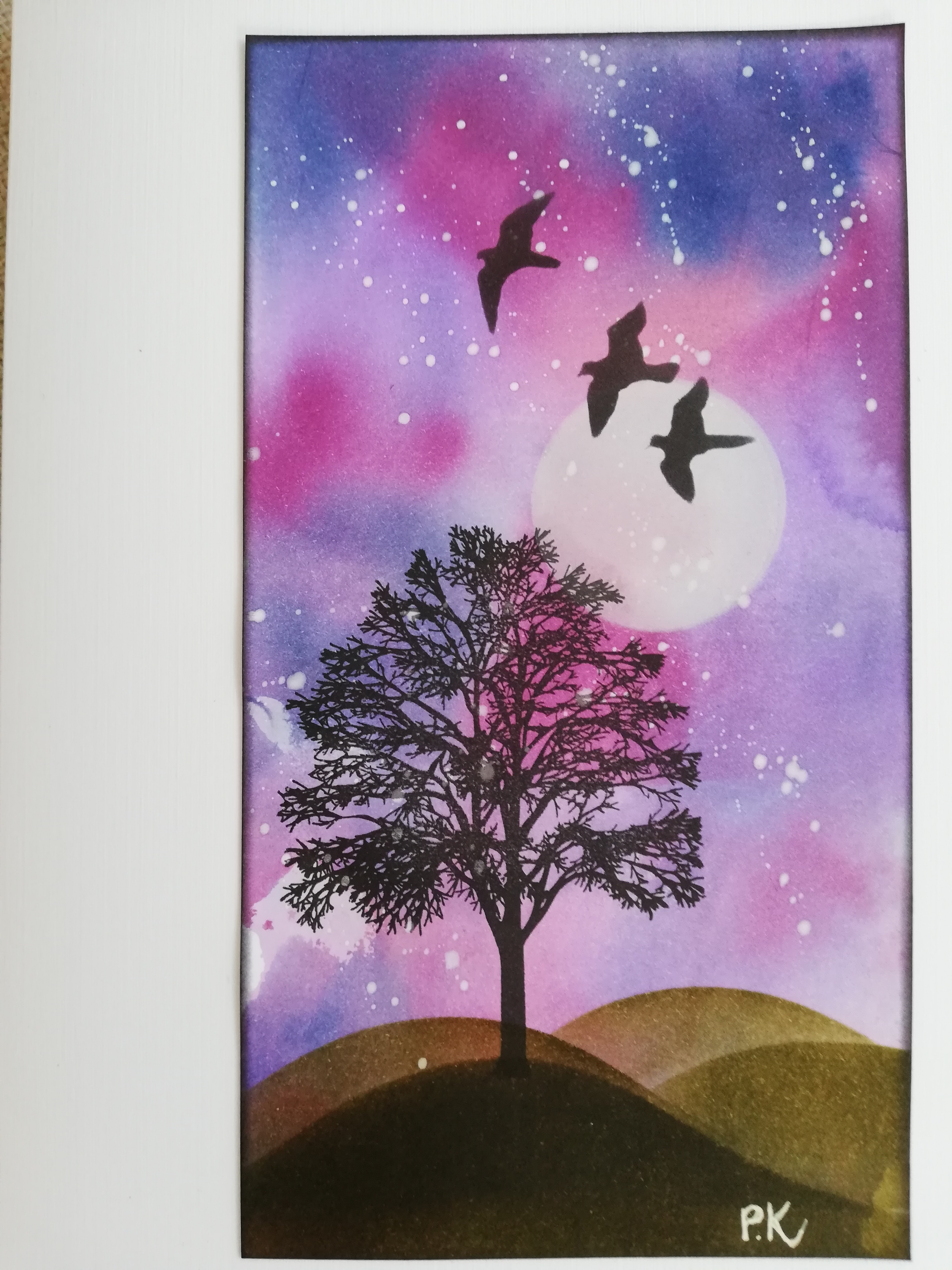
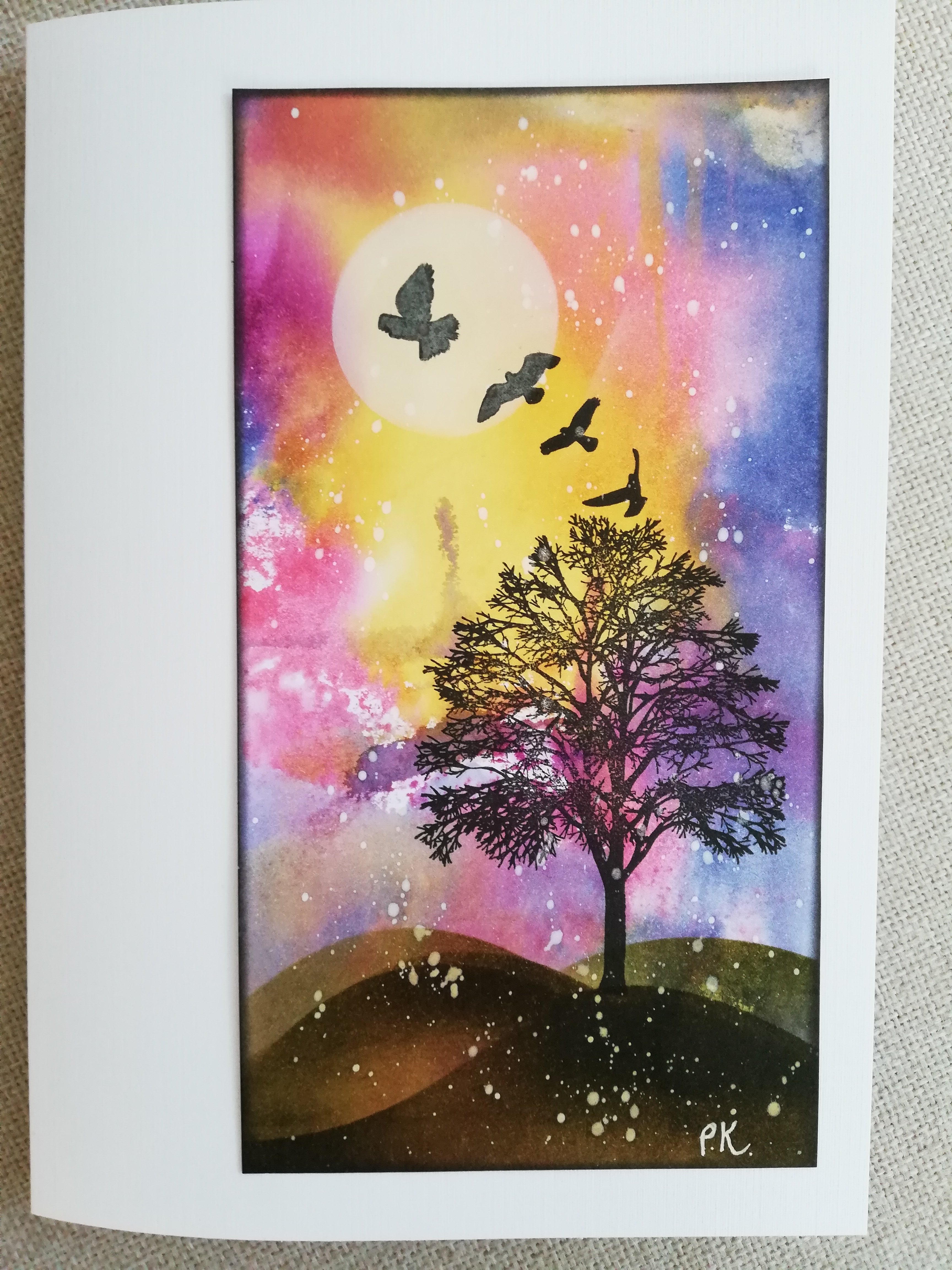
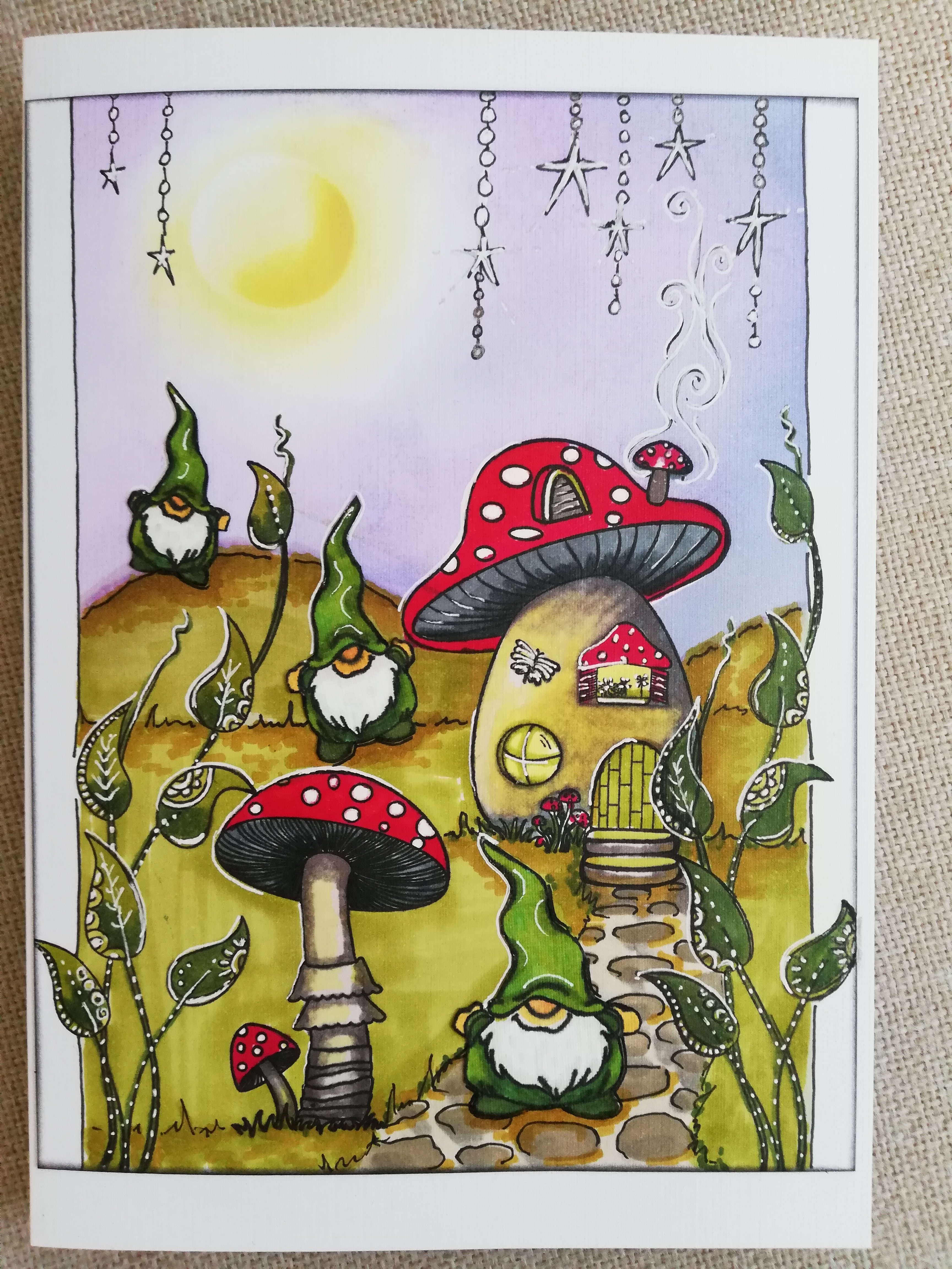
I like to be technical in my responses, so let me say: That woman was being a poop. Your art pieces are beautiful, Pauline. Vivid, yes. But in a way that is both attractive and gentle at the same time. Well, except for the one with the gnomes and the mushrooms, which is of an entirely different genre, very cheerful and would be a perfect pick-me-up for some occasion.
LikeLiked by 2 people
Your technical response made me laugh Cynthia. Thanks for coming by and joining in. The gnomes have been banished to the USA!
LikeLiked by 2 people
Reblogged this on LIVING THE DREAM.
LikeLike
SUCH GREAT PIECES OF ART, LOVE THE COLOURS, CHINA
china.alexandria@livingthedream.bloig
LikeLiked by 2 people
Thank you very much China 🙂 Thanks so much for coming by and for reblogging this post too – very kind!
LikeLike
Pauline, I followed you back here from your like to my comment on Frank’s CSNY post and what a delight! I see other blogging friends visit here (Frank and Robin are old friends) and so I am enjoying my exploration of your site. Regarding this post, I can only say that I have a thousand colors in my garden and several collections of colored pencils which delight me.
LikeLiked by 2 people
Aren’t coloured pencils a complete delight. Visitors to my craft room often take photos of my pencil collections – not my art, just my pencils 😀 And your garden is beautiful!!
LikeLiked by 2 people
They are a complete delight! I love my pencils and in the winter especially treasure them as there is only black and white and brown outside in the garden. Thanks for visiting!
LikeLiked by 2 people
It was a pleasure ❤
LikeLike
Pauline, I remember reading this before going away for two weeks. I was sure I responded, but I don’t see my reply here now. What kind of dun-colored wet stuff you don’t want to step in is that?! We love Pauline for her brilliant colors! Take that you stupid, silly shop owner!!! xo
LikeLiked by 2 people
It’s always possible wordpress decided to randomly spam you Luanne and I didn’t check my dashboard in time to save you. I’ve found one or two comments for this post in spam. Your pointedly partisan comment just made my day 🙂 ❤
LikeLiked by 1 person
I love making your day!
LikeLiked by 1 person
❤ 😀
LikeLiked by 1 person
COLOUR! For me! Every time! Colour is life. GREY and BEIGE are boring to me with no vitality. I could relate to your shop visit so much, Pauline – it is sooo typical of what can happen in practice when you go in with your wares. What made this more extreme was that you were invited. So quite unbelievable, really. Your work is gorgeous and I’m pleased you went straight into making more art. I’ve been in one or two gift type and interiors shops today in a posh borders town called Peebles – they really were all tones of grey and beige, glass and brass. I looked at a new garden furniture area in my local garden centre – all dark grey wicker. Lumps and humps of it. And don’t get me started on grey (aka, silver, according to the manufacturers) cars. I have very firm opinions about all this, as you might suspect ;>) Your work would fit so well in a little gallery/gift shop where colour is celebrated. Ethnic type, crystals and symbolism, arty types of customers, spiritual types, beaded trees, you get the idea – I was in one of those shops today too. I love that you shared this experience, Pauline. Well done you. X
LikeLiked by 3 people
Apologies for the late response Lynne. I’ve been lying low for a while and forgot to check my own blog 🙂 I’m such a gypsy and aging boho you are so right – I just don’t blend in well with all the modern neutrals! I nurture a secret desire to take to the roads in a gypsy caravan with an elderly and gentle plow horse in the traces……..
LikeLiked by 2 people
I would choose your bright, happy, positive colours every time, Pauline. What a pity the store owner couldn’t see how much your art would brighten up her store and the lives of everyone who entered. The dull grey and beige sameness of neutrality is not for me. We need vivid life.
I love that Orlando loves books. Is he reading the one about his name? And your cute little garden gnomes are there to be excited about.
I would choose an individually crafted card over a mass-produced card whenever possible. Your work is tops, Pauline.
LikeLiked by 2 people
Goodness Norah, apologies! I’m very late coming here and finding your lovely supportive comment. Thank you so much for coming by – and yes, absolutely – Orlando is reading ‘his’ book. ❤
LikeLiked by 1 person
Perhaps I was late visiting with my comment. No worries, Pauline. It’s always a pleasure to stop by. I understand when life draws you in other directions.
LikeLiked by 1 person
Thank you Norah 🙂
LikeLiked by 1 person
The shop-woman sounds like my husband, Pauline. He likes “Earth-tones” which in his mind is the equivalent of tan and beige. As if the Earth isn’t loaded with bright colors. I love your artwork. It’s wonderful and always leaves me smiling. I’ll take color any day. 🙂 I hope your winter is passing by full of vibrant fun.
LikeLiked by 2 people
I have known a number of people of the male persuasion in my life who are only comfortable with the neutrals – or maybe just uncomfortable with colour. I’ve often wondered if it has something to do with colour blindness or just conditioning? I have no clue really …… Appreciate your input Diana – where would we be without nature’s colour palette! ❤
LikeLiked by 1 person
Conditioning, I think. It would make an interesting study!
LikeLiked by 1 person
Yes it would!
LikeLiked by 1 person
These comments were fascinating. It pays to be late when reading posts, because then you get to read what so many interesting, and supportive, people say!
As for your post….The saleswoman was just darn rude and dismissive, and telling a big untruth, as she is obviously not interested in supporting local artists.
Vivid colours can be very tricky, and I think you handle them so well. Because they are bright, they can overwhelm (I am thinking of some awful tie dye fabrics I have seen). Your work has the bright, but also the simple, clear darker shapes to act as a counterbalance. They are lovely. And your gnomes made me smile, such cheeky, happy chappies!
LikeLiked by 2 people
Hi Anne, thanks for coming by! I admit to feeling quite uplifted by all these great folks who come out swinging on my behalf – I had no idea you all would be so offended by her 🙂 It’s a pretty cool platform where we get to feel so supported by our friends isn’t it. I’m also amused, as yes she doesn’t have too much going on in the realm of social skills and has a delicate connection to truth – but you know, no-one died and I learnt something and then got to feel really supported and protected by everyone here. I know who I’d rather be. And thank you for your thoughtful reflections on my use of colour, they are much appreciated. ❤
LikeLike
This is her loss. Carefully staying with beige and grey she is missing out on the excitement and magic of color. She is going for the safe and bland over the zing and spark color can evoke. Color speaks to us in so many ways. It calls for responses from our emotions, souls, and brains. It attracts in ways beige and grey can’t. If you walk past the aisle full of cards what jumps out at you are all the different colors. It’s stimulating. Again, this is her loss.
LikeLiked by 2 people
Beautifully said SS. Thanks for sharing your thoughts.
LikeLiked by 1 person
so beautiful! I am always truly mesmerized by your artwork– I think that’s the only way I can think to describe it! These paintings call to my inner child while simultaneously calling out to my adult- dreams ❤
LikeLiked by 2 people
Goodness! Thank you Mackenzie – you just made me smile and made my day! ❤
LikeLiked by 1 person
How sad for the shop owner! She could have enticed a whole new group of lovely buyers into her shop if your cards were in her window! Pauline do you do pictures as well? (I’m thinking like 8 x 10 or 5 x 7, inches that is- LOL!) I love gnomes too!! (altho I call them Tomte ;o)
As someone who has Faeries in their yard, here in the woods- you know everything in my life must sparkle!! And colors, the brighter the better. White always accentuates color perfectly! I just painted to lamp bases bright red with a top coat of sparkles and a final coat of super shiny varnish gloss. I can’t exist in a world without vibrant colors and sparkle. It only gets worse as I age! :o)
I love your attitude with the shop keeper! But she is missing out. Someday she’ll remember you and realize she was too quick to respond! :o)
LikeLiked by 3 people
It’s so much fun adding colour into decor isn’t it. I live in a house full of blues and greens with cream as the background. Though I’ve noticed that lately I’ve been adding in more shades of purples and purpley-pinks – maybe I’m maturing at last 🙂
If you go back to the post before this one the last two pictures are just pictures, done on A5 card. We are metric here, so hang on while I get my ruler out…………. A5 + 6 1/4 x 8 1/4″. I typically work on A4 paper or card which doubles the size of the A5, so 12 1/2 x 8 1/4 ” approx. Then I go up A3 (2 pieces of A4 side by side) and rarely on A2 (2 pieces of A3 side by side) but when I’m working that big I prefer to be working on canvas or board. Hope that all makes sense for you.
LikeLike
I matured when I started using green! I rarely used it! Now I am loving it! :o)
I understand your explanation, thank you! I was interested in purchasing something with gnomes (no words) on canvas or board. Would that be possible?
LikeLiked by 1 person
It’s always possible but the postage would be considerable – If you want me to look into it I’ll do some research for you.
LikeLike
I’ve sent a lot of things back and forth with Aussie friends and it was quite reasonable. Is it a lot more than they pay? I really don’t mind paying the postage for a work of art! :o) So don’t worry about postage- I’ll pay- its not every day you get to buy from a NZ artist!
LikeLiked by 1 person
Well that’s so sweet – thank you 🙂 I think postage is much the same as Australia – depends on the exchange rate on any given day. Can you go into the ‘Contact Me’ page just below the header pic Eliz and send me your contact details and the size you are interested in – approximations are fine . And we’ll talk a bit more about what you want.
LikeLike
What would the world be without colours. I know, we all love colours in our own way, and we all see “colours” difference. I love yours, they always make me smile. The best one yet is of Orlando. 🙂 I love kitties, and doggies.
Good for you for taking the “experience” in your stride, I just knew you would.
I do buy cards at times, and always try and get a card that will be loved by the person. It must suit them and what they like. Then I know they will love the card, and not just pack it in a box.
have a great coming weekend, and happy crafting. xx
LikeLiked by 1 person
Thank you – I appreciate your understanding Joey! I have personal experience of your card choice and can confirm you choose well 🙂 My zebra card is waiting for Advent to be displayed in the correct season 🙂
LikeLiked by 1 person
I wanted to share the festive season and holidays in a more typical South African way. And since we then have summer and no snow and all, the wild animals in a festive mood is more our way. 🙂
Happy Solstice today, and enjoy your walkies, hugs to the furry children. xx
LikeLiked by 1 person
I must get you to send me your address, I couldn’t read it on the back of the envelope it was a bit smudged. Can you go the ‘Contact Me’ page below the header pic and email it to me please.
LikeLiked by 1 person
🙂 Thank you. I will do that.
LikeLiked by 1 person
Oh, please! I am so totally irate at that horrible person. It’s okay for her to have an aesthetic she wants to promote in her shop but why be such a b*tch about it?!?! And so narrow! Jeez.
Your work is everything you are, Pauline–whimsical, sweet, happy, spontaneous. You went crazy with the white doodle pen because it made you happy, in the moment, and that is what your artwork is all about. It makes us all happy, and feel better, in the moment.
I have to admit, I’m not much of a greeting card person. I think it’s (probably misplaced) frugality, to spend $5-$10 on a card that gets a few moments appreciation then gets pitched. Don and I sometimes go to the greeting card aisle, look at cards, and say, “Here, this is the one I’d buy for you,” and then we put them back and o have ice cream with the greeting card money!! Having said all that, I do love bookmarks and would do most anything to have one with Orlando on it . . .
LikeLiked by 2 people
Most of my cards are really blank notecards in which you are meant to write profound, supportive and loving short letters to the recipient. Being that I make ’em, I also send them out as birthday cards too 🙂 I haven’t bought a commercial card in years and am appalled at the price of them. You and Don in the card aisle admiring and then going for an icecream is delightful – I could turn that into a card!! 😀
Orlando’s bookmark has been designed 🙂 This morning I’m thinking to make a Siddy one too ……. We’ll see. That Alys has such good ideas!! ❤
LikeLike
I certainly don’t want to live in a world of beige… your ‘grow where you are planted’ picture brightens my life every day… it would probably give Mrs Neutrals a heart attack!!
As for greetings cards – I try never to buy from big companies and love to support artists or make my own. Looking in my drawer of cards ready to send I have some of yours, some of mine, and until recently I had some from local artists Lil Tudor-Craig and Kate Murray plus a couple that I sent the other week that I bought from the museum in Aberystwyth (also by a local artist). I don’t think I’ve bought a ‘Hallmark’ type card in years!
Do what you love – everyone likes different things and you can’t please all of the people all of the time, so don’t try.
LikeLiked by 2 people
Appreciate you weighing in with your thoughts here Jan. A drawer filled with hand made and home made and local artisans work sounds fabulous to me. Good stuff!
LikeLike
Pauline, I love that you (in the comments) chose to think of the “shop” experience as another thing you have learned. That’s a lovely way to package up that woman’s behavior and place it on the curb where it belongs.
LikeLiked by 2 people
Yes, exactly so thank you Jodie 🙂 As so often in my posts it is my friends weighing in with their reactions and thoughts that really clarifies an experience for me. There is always something to be garnered from every experience we have, sometimes it takes a while to see what it might be – but it’s there if we look. Sharing helps clarify things doesn’t it – one of the delights of being a woman! 🙂
LikeLiked by 1 person
You are so right, Pauline. I can remember several times where you were that very person for me. I didn’t even know what I was thinking until you gave me the words. ❤
LikeLiked by 1 person
❤
LikeLiked by 1 person
When is your art not vivid colors? 🙂 … Well done … as for the cards, I lean toward the cart companies because I’m buying in a hurry – but love local artisan cards.
LikeLiked by 2 people
Quite so Frank. I am congenitally unable to work in pastels! I note that your card buying is ‘in a hurry’ – you and every other man I know 😀 Appreciate you taking the time to weigh in here.
LikeLiked by 1 person
Hey … I see plenty of females at the same card-buying stand.
LikeLike
😀
LikeLike
I love, love, love your vivid colors and originality (and if I had to pick favorites from this post, the first and third really speak to me). I prefer to buy work from local artists but sometimes have to resort to Hallmark (or something similar) when I’m in a hurry. I try to buy what I think the receiver will like.
I just spent a week with a good friend who might be considered very tasteful by your shop owner. She loves neutral (what I consider somber) colors. We jokingly remark on how we are such opposites. She loves antiques and browns and beige and ochre. I love the new, the fresh, the vibrant. It’s a wonderful thing when we get together and learn from each other. 🙂
LikeLiked by 2 people
Thank you Robin! I also have a neutral friend and we have often wondered if we can borrow a bit of the others style….. My friend though stays in her tones of grey because she is afraid of colour. I am booked to go to a gallery with her to choose some colourful art for her wall – a starting place. “It’s a wonderful thing when we get together and learn from each other.” Absolutely! ❤
LikeLike
The cards always have nice envelopes, lined with a patterned paper and made with nicely weighted paper. https://www.papyrusonline.com/birdie-with-flowers-card
LikeLiked by 2 people
It’s such a nice touch! ❤
LikeLiked by 1 person
This is one of the artists I like featured by Papyrus. I even fashioned a Halloween costume from one of her cards a few years ago: https://www.papyrusonline.com/collection/bella-pilar
LikeLiked by 1 person
Lovely work!
LikeLike
From Wikipedia: Greeting cards[edit]
Boynton’s greeting card designs for Recycled Paper Greetings were at the forefront of the Alternative Cards commercial movement that began in the mid-1970s. According to RPG co-founder and president Mike Keiser, nearly 500 million copies of Boynton’s distinctive humorous cards—featuring an assortment of unnamed cartoon animal characters, spare layout, and droll messages—sold between 1973 and 2003. The best known of these is a 1975 birthday card bearing images of four animals and the message “Hippo Birdie Two Ewes”, a pun playing on the phrase “Happy Birthday to You”. The card has sold over ten million copies to date.[3]
LikeLiked by 2 people
Oh, I was right there on the edge of that movement buying all of Sandra Boynton’s cards. I didn’t know that Hippo Birdie Two Ewes sold that many copies – but I bought it for everyone for years.
LikeLiked by 2 people
That is the most clever card sentiment I ever heard! Love it!!
LikeLiked by 1 person
Each word had a little cartoon animal above it. I thought it was the best thing ever.
LikeLiked by 1 person
Not only do I love her cards, but I bought all there children’s books when my boys were small. We read them (and sang them) over and over and over again. Her work is charming. I’m glad to hear of another fan, Jodie!
LikeLiked by 2 people
I din’t know she wrote books! I’ll have to check that out if there are ever any grandchildren headed my way. (fingers crossed)
LikeLiked by 2 people
Fabulous books! My first purchase when I found out I was pregnant with my now 22 year old son. You can make up tunes which we did or read or chant. Just delightful.
LikeLiked by 2 people
…and fingers crossed.
LikeLiked by 2 people
Yes, fingers crossed for you Jodie
LikeLiked by 1 person
LOL – No pressure, kids. Honest.
LikeLiked by 1 person
It’s always nice to hear of a creative success – thanks for sharing that Alys ❤
LikeLiked by 2 people
Pauline I could so clearly picture you at that counter producing your lovely cards, only to be summarily dismissed. It hurts my heart that anyone could be so cold and distant about someone else’s art and creativity. It’s taken me a bit of time to recover. You are certainly right that we all have different tastes, different likes and dislikes, but it’s no excuse for her treatment. Lots of shops succeed and have very different styles and tastes. There is something for everyone, too. I happen to love your creativity and always have. I think your gnome card is full of charm and in fact always think of gnomes in a busy background doing whatever it is they do. 😉 It’s lovely and perfect and you.
I gave a mixture of cards: some I’ve made myself, many that I buy from other artists (like you) and I too like the Papyrus cards. I’m not a fan of Hallmark and American Greetings in general as they have a sameness about them, but again, that is what many people seem to like or they wouldn’t have been around for so long. It’s personal, isn’t it? I wish you could find the perfect shop in town to carry your cards.
I’m reminded of Sandra Boynton’s original greeting cards. She shopped them to all the major card manufacturers, rejected by every one of them. They were “too white” or “not enough background” etc. Then the newly minted Recycled Card company took a chance on her and she became a smashing success. J.K. Rowling has a similar tale. It takes incredible strength to put your art out into the world, as every piece is an extension of you.
I too like the Papyrus cards, and have the boys “trained” to look for one when they get a card for Mike for his birthday or Father’s Day. They’re pricey as cards go, but still under $10 US vs $4 – 5 US for Hallmark. Handmade cards in shops can run about the same.
Now on to the cards. I love your wash of colored backgrounds. I like the way you often shine light onto your scenes and I like your use of nature.
The Orlando card got me thinking, too. If you’re ever inspired, you could move the text down along the books to narrow the design and print bookmarks. I would buy 100 of them for my LFL. Just a thought.
I will find a couple of links if I can keep my eyes open a bit longer.
LikeLiked by 3 people
Your first paragraph sums up my feelings very well.
LikeLiked by 2 people
Thank you, Jodie.
LikeLiked by 1 person
Hello Alys, thanks for joining in the discussion. I’ve followed the links and had a peruse of the Papyrus cards. It’s nice that good quality, professionally presented commercial cards are available and I can see why they are preferred by so many of my refined readers 🙂 While I’m not sure if they are available here I know we have some companies selling beautiful cards, both in terms of the art and the paper quality. Though of course the cost is much higher here.
I appreciate and smile at your indignation at my experience. I wasn’t harmed, really just puzzled by the whole thing – it’s just another chapter in the marketing saga really 🙂 Clearly marketing is not something I’m comfortable with and I am quite content to carry on as I have been.
I really like your suggestion to adapt Orlando’s card into a bookmark. I’ll see what I can come up with. How about (if I succeed) I simply email you a scan and you are then free to print out as many as you wish. I’d be very happy if Orlando adorned the books for your littlest LFL readers. As always I appreciate your friendship and support xo
LikeLiked by 1 person
xoxoxoxo
LikeLiked by 1 person
Check you email Alys
LikeLiked by 1 person
I try to support local artists with every gift I buy, including cards. I shop local as much as possible. I choose card not so much on color, but on the feeling they convey. I want my greetings to come with feeling. It just so happens that most cards that yell “joy!” “Happiness!” “Greetings” “thinking of you” are vivid and bright. Even a more solemn card can be bright. What better way to cheer someone up or offer condolences? I think your creations are unique and marvelous! Especially anything with Orlando:) xx
LikeLiked by 2 people
I’m delighted to hear that you support your local artisans Cheryl – though not at all surprised! I like very much what you have said here on your selection process too. I agree! Thanks for weighing in 🙂
LikeLiked by 1 person
Your work always brighten my WordPress reader AND the faces of my friends when I give them one of your cards. Carry on doing what you love, Pauline. Many of us love what you do. As for kinds of cards I buy? It varies. I pick them up browsing thru an artsy store near work and most are made in Canada and have beautiful photography or funny artwork. But I also buy the mass produced Papyrus cards (so pretty with lots of glittery embellishments) and even Hallmark, if the message is fun.
LikeLiked by 2 people
Thanks for your support Susanne, I’m glad you are spreading those cards you bought around. I’m going to have to look out for that Papyrus brand as several commenters have mentioned it here. They sound rather nice. I don’t usually buy cards as I have so many on hand 🙂 I’m glad to hear you support your local artisans too – such a very good thing to do!
LikeLiked by 1 person
These cards are sooooo beautiful. I saw the blog on twitter las night and went there and couldn’t believe she didn’t use the cards to add color! I think some people find the “dirt colors” grays and whites soothing or zen like. Others just have color free homes because they’re afraid if they buy color it might clash. Anyhow, I’m sorry you had that experience. Yeesh. I don’t know that I would have been able to bite my tongue the way you did!
LikeLiked by 3 people
As I’ve said elsewhere I respect her colour choices, mine are different and that is just fine. It was, as I’ve discovered through the conversation going on here, more the unnecessary untruths told – about having seen my work before I went in (I didn’t even mention that in the post) about supporting local artisans…… and wasting my time. Though time is never really wasted, it was just another experience of the world. Maybe now I’ll actually get around to updating my shop here instead of simply thinking I really must do that one day 🙂
LikeLiked by 1 person
Well, I think the awfulness of the encounter is what made folks react to the color choices–and of course we all like color and your cards! Just sending support and virtual hugs!
LikeLiked by 1 person
Yes. you are likely correct Lisa. And I of course appreciate your support and hugs. Looking forward to our catch-up this weekend ❤
LikeLiked by 1 person
I have noticed the trend of limited colour patterns, especially in muted browns and greys. I have seen it not only in shops but also in peoples’ homes. I’m sure the shop owner is finding a niche for herself, and hopefully it’s working for her and the people who wish to shop in a place where colour is banned. You, on the other hand, wouldn’t fit well there, and that’s great. As you say, we are all different and having browns and greys is one reason why I love the vivid colours so much!
Don’t be too quick to criticize your excessive white pen doodles. The gnome card is my favourite of all of these, and other people mentioned it too! You have a great sense for design, and even if you don’t like the finished product for yourself- trust the process and trust in your own instincts, because you are probably creating something that someone else is going to love.
LikeLiked by 5 people
Ah Crystal – you are a gem, reminding me (again) that we all like different things and just because it isn’t my fav doesn’t mean it won’t be someone else’s…. Thank you for that. Like most artists I have a well developed self criticism button and when I really don’t like my choices I presume everyone else will feel the same. (Don Miquel Ruiz tells us not to make assumptions and he is right!!) If you want it, I’ll send it to you, just send me your details via the ‘contact me’ page above the post.
LikeLiked by 1 person
Done and done! I would love to have the gnome card! And if you mail something to me, then I’ll have your address for a returned favour. 😉
LikeLiked by 1 person
I don’t expect anything in return Crystal, please don’t think that is a necessity at all. I love to send the odd thing off to someone who might appreciate it 🙂 I have your details and will get it into the mail early next week. Enjoy!!
LikeLiked by 1 person
Yes about the gnome card. It popped right out at me and I made a point to remember the white outlines on the mushrooms, hats, etc. so I can steal that idea myself.
LikeLiked by 2 people
Steal away – I probably learned it from someone else ages ago……
LikeLiked by 1 person
To each his or her own, Pauline. Her loss. I grew up in the tropical region of vibrant natural colors. I love lots of vibrant colors. Your work captivates me. I buy my greeting cards from local artists who sell their work at our city’s twice-a-year fair for our artisans of all stripes.
LikeLiked by 2 people
So glad to hear that you support your local artisans Rosaliene! It seems people who love colour come by here 🙂 ❤
LikeLiked by 1 person
Pauline, you must know she has an extreme lack of social skill. I have a feeling the dismissive woman’s shop won’t last very long. How can you sell only bland, commercially made trinkets from foreign countries (will lax labour laws) ? How rotten to treat you and your work with such disregard, and after inviting you. Mauvaises manières or as we’d say in the hood, “so tacky”.
Colour brings smiles and opens the eye’s wider. Oh and the tacky shop owner need only look to Instagram to see, “rainbows rule the design world” . That includes, fashion, art, home decor and yes, the much loved paper filling my room 😉 . I would bet, she’d be a real pill to have any professional relationship with, so you dodged a bullet there! xoxo ❤ K
LikeLiked by 4 people
Ha, your final sentence makes me feel quite lucky K – well done!! That’s intriguing what you say about IG – I just wrote a reply to Marlene about it all being dun neutrals here – and of course there are folk who always follow fashion. I have always surrounded myself with colour and would fit in very well in India and other brightly hued locations. When I was younger it was all oranges and reds and slowly I moved through to yellows and greens and so on until I reached the blue and purple end of the spectrum….. I’ve lived a rainbow, just not all at once 🙂 Thanks for coming by, so lovely to see you xoxo
LikeLiked by 2 people
I agree with Kate that Papyrus makes beautiful cards that look hand made but are very pricey. It does depend on whom I am sending the card as to what I pick. For a while I made my own computer generated cards with a personal touch for the individual but lately…oh, well. I could not imagine a shop with all neutrals in it. There isn’t one of your cards that I would not send to one of my favorite people. I do so love the last 2 on this page and would send lots of them but those at the top are special cards for very special people. I’m very fussy and I love color. For a very long time, I found cards with butterflies on them and even sew them onto the back of some of the quieter shirts I make. Kind of a signature from me. I am undoubtedly your #1 fan and looked at your gift shop to see if any of your recent art was for sale as cards. Time to get busy. I do love to find special local made cards here and think I have given all mine out. I love the art and craft fairs we have and often stock up there. I would not give one in ochre, 😦 That poor shop owner must know a lot of bland people to stay in business. I’m pretty boring but I love color! The only other comment I can make is that small cards or any odd sized, cost more to mail here. Go figure. They want everything standard or they mangle it in the sorter. I want all the art you have here including the header. 🙂 It’s all heart lifting. The woman is a tasteless. Her loss.
LikeLiked by 3 people
I think the dun neutrals are very in at the moment – in decor and clothing and apparently art, though that had passed me by until now. I respect her choices, like I said it would be awful if we were all the same. But I was saddened by her dismissal of colour I guess. Still it’s all water under the bridge now. That’s interesting about your postal charges Marlene. We have a standard upper size, but not smaller. I make cards generally A6 and A5 sizes (metric) and the difference in postage is minimal, though when I send overseas the cost rises dramatically. I do mean to put some work into my shop and keep forgetting 🙂 I’m not good at marketing 🙂
LikeLiked by 1 person
I was never good at marketing either. ;/ I am into basic colors for my clothing but like to spice it up with accessories. I have white walls covered with so much color in art, etc. Basic neutrals have their place. I’m not a fan of it in art.
LikeLiked by 1 person
I love your use of bright colors!
LikeLiked by 2 people
Thank you 🙂
LikeLike
Oh no! I thought this story was going to have a very different ending when I read the first paragraph. Much as the lady has the right to stock whatever she has in her shop and people have the right to buy less colourful art, it’s a shame she’s so deluded that she’s helping local artists when she isn’t really helping local artists at all. Quite the reverse I suspect, as I doubt you’re the only one to have this experience with her. This could have been a totally self-belief destroying experience for some and could also set them off on a path of trying to please a shop owner rather than having faith in their own style. Fortunately I know you know your work is amazing and you know you love colour and you know how important it is to be yourself.
I’m loving all the cards – the gnomes particularly made me chuckle- I seem to have a lot of gnomes appearing in my life at the moment. Can you have a gnome as a spirit totem? 😉
As for the look on Orlando’s face on that last card, it’s priceless – if I’d seen them in a shop here I’m sure I’d have bought several for my writer friends.
LikeLiked by 2 people
Gnome spirit totem! ha ha haha
LikeLiked by 2 people
The gnome thing is going global – they first began to appear in my life again about 18 months ago and apparently have a lot to say!! And why not a gnome spirit totem 🙂 If I could design a card that shows Orlando happily and proudly imbuing knowledge through sitting on an open book I would – this is the best I can do for now 🙂
LikeLiked by 1 person
Interesting. I haven’t mentioned gnomes to anyone and hadn’t been counting but now you say 18 months, I remember the Christmas before last (18 months ago) I decided to leave my Christmas gnome doorstop out because he is so lovely and Mr Hicks was no longer here to shred him at an opportune moment when I wasn’t looking. I often smiled at him and said hello as I passed until Harry arrived and he got rather shoved in a corner because I shut the door to the kitchen at night for Harry. I haven’t put him away away though, because Harry doesn’t have the same shredding tenancies. Think I’d better start treating him a little more kindly and start talking to him again.
LikeLiked by 1 person
See! My theory is with the earth suffering as she is, the gnomes are everywhere trying to wake us all up….. Them who notice have the right attitude. Treat him well!!
LikeLiked by 1 person
Interesting idea. I completely agree there’s lots of signs telling us things that we miss unless we are paying attention to them – which is exactly why I was was taking notice that the gnomes keep turning up and commented when I saw your card.
I was thinking the message was about grounding – as they’re gnomes. I’ve also felt my doorstop gnome is watching over me ever since I first decided he wasn’t just for Christmas, before all the other gnomes started turning up.
LikeLiked by 1 person
I think you are right about the grounding – part of being grounded is being aware of our surroundings – it’s all connected!
LikeLiked by 1 person
It always is 🙂
LikeLiked by 1 person
Originality, composition, humour, message are all more important than palette. That grey lady will never wear purple.
LikeLiked by 4 people
🙂 Did you read ‘The Grey Gentlemen’ (later renamed ‘Momo’) to your children Derrick? (Author Michael Ende who also wrote The Neverending Story) It’s a good little story even for adults. Appreciate your input 🙂
LikeLiked by 1 person
Not heard of the book, but male politicians here are known as men in grey suits
LikeLiked by 1 person
Gorgeous, whimsical, heartfelt and hopeful. Beautiful work as always, Pauline. xo
LikeLiked by 2 people
Thanks Pam
LikeLiked by 1 person
🥰
LikeLiked by 1 person
I try to make cards myself to send – although ‘somebody’ sent me some nice ones recently that I have been giving out with gay abandon. Mr. Tialys got one from Mlle T. the Younger for Father’s Day on Sunday and I sent a lovely doggy one to the Old Dog Refuge, plus an artist friend of mine received one for her birthday. I’ve had no complaints 😉
I do understand if she feels your cards don’t go with the ‘aesthetics’ in her shop but it sounds as if she handled it in a very unsympathetic manner and perhaps could have recommended another shop where your talents would be more appreciated.
Don’t be discouraged by an ochre clad martinet and carry on spreading the colour around to those who appreciate it. xx
LikeLiked by 3 people
Thanks Lynn, you made me smile. As to ‘the experience’ – her manner is her manner I guess and I wasn’t discouraged for more than a moment really – more a tad annoyed at the wasted morning. When she first approached me I had given her my blog address and suggested she look at what I made and she later said she had – when clearly she hadn’t. I’m always discombobulated when unnecessary fibs are told and that’s the bit that drove me to write this post I guess (moment of enlightenment) 🙂
LikeLiked by 1 person
Oh heck, give me colour any day! Personally I go for local artists (UK based as I live in England). I love to support new and up and coming businesses. Generally their work tends to be unique and that’s what I love. I absolutely love your work and the gnomes with their houses are adorable!
LikeLiked by 2 people
Yay for you Sam!! Thanks for stopping by and adding in – it’s much appreciated 🙂
LikeLiked by 1 person
Your delightful designs and use of color are wonderful, Pauline. I’m always left smiling after viewing your work. I’m wondering how that woman stays in business!
LikeLiked by 2 people
I’m sure she has a niche Jill – it could just be a bit bigger 🙂
LikeLike
I am so sick of blues and greys on cards and no design either. They don’t say anything to me. Now I go through all kinds of phases with colour elsewhere. The décor in this house is far softer and lighter than the last house so there you go. This is not a ‘I don’t like blues and greys.’ Her loss I’d say. As for supporting local artists? Well, these people like to bump their gums about that but seldom put their money where their mouth is but pontificate on like they know everything about something YOU do at the end of the day. Not them.
LikeLiked by 3 people
Lol Shey!! ‘Bump their gums’. I’ve not heard that before and am going to use it from now on 🙂 It does appear there was a bit of gum bumping going on 🙂 Thank you darlin’ ❤
LikeLike
It’s a kinda Dundee saying that one. And there was what we call ‘pure’ gum bumping.’ ( The use of the word ‘pure’ in oor toon is indeed like ‘unadulterated’ as in the term for pure vodka, but it is also like ‘come on, can you believe it?’ No-one should ever be rude as this bint. Especially when your work from colour to design is lovely and I am not just saying that. I could have gone into art. I didn’t. I did other things. So do not let his knock you down in any way. I pure love your work and it is pure obvious it’s cos it’s good.
LikeLiked by 1 person
I can add ‘pure’ onto the gum bumping 🙂 I’ve written it down so I don’t forget. If It makes it to a card you’ll get one sent your way 🙂 Thank you for your generous support.
LikeLiked by 1 person
I am just telling it like it is Pauline. Honest. I never goo over things I think… NOPE, go learn your craft. I try to be constructive. I will always say what I think AND I hate when people behave like that woman. Who the hell is she exactly??? Well? I especially don’t like when I see people with real talent getting a knock down. xxx
LikeLiked by 2 people
You is good people xoxo
LikeLike
Lol. I am just me xxxx Just had another look at your work there and it is brimming with beauty,
LikeLiked by 1 person
Oh colourful every time. I make some cards and I buy a lot of cards from local artists, can’t afford their pictures but can afford the prints on cards and postcards. Fancy her not even giving your work a punt. When I bought for a gift shop I bought small amounts of lots of things to ensure local people would always see something new. It’s not what she likes that counts but what she can sell to everyone. fancy limiting her customer base. A bad business woman for sure.
LikeLiked by 2 people
Appreciate hearing your experience Cathy – as that’s the bit that kerfuffled me the most, the lack of colour choice. Still, it’s her shop and she can stock what she likes – she’s been there a while so must be doing okay.
LikeLike
Your cards are joyful! and I like the white pen adornments.
I hardly ever buy cards as I make them myself.
As you say, I wonder why that shop owner approached you and I wonder long her shop can survive.
LikeLiked by 2 people
Thank you Sandra. Maybe she got me mixed up with someone else? I bet you make beautiful cards, you have such a good eye for colour!
LikeLiked by 1 person
Firstly I would like to know how many sales that rude lady actually makes. I’m guessing not that many. And she’s not really interested in local artists at all. I reckon you may have dodged a bullet by not having to work with her after all. Secondly, your work is simply beautiful Pauline so please keep doing just what you love. I really like all these cards and the colours are gorgeous. 💜
LikeLiked by 3 people
You raise a good point Carole, I doubt I would have made any sales anyway if the customers like the trendy grey scale thing. I guess the loving local artists thing was just something she intends to do. Nowt as odd as folk! 😀
LikeLiked by 2 people
It sounds to me like she’s all talk and no action.
LikeLiked by 1 person
‘Bumping gums’ as Shehanne Moore says 😀
LikeLiked by 1 person
🙂
LikeLike
Neutrals for somber occasions, but for everything else, the more color, the better! I think your work is outstanding.
LikeLiked by 2 people
Apple, you got spammed! But I just rescued you 🙂 Thank you for your comment. Clearly this blog attracts the colourful people of the world ❤
LikeLiked by 1 person
Lol, I missed all that, but thanks for the lifeline.
LikeLiked by 1 person
Colour, rather than neutrals. But it’s hard to be more specific than that, because I try and choose what the receiver would like rather than what’s my taste. For example, the MIL likes cards with flowers and butterflies and lots of pink and messages and poems. Me? Not so much… I have a favourite card brand (Papyrus Cards), and while they’re more expensive than most, I think it’s worth the money to get something I love and that I know the receiver will love too, because they’re clever, imaginative, colourful (and I almost always want to keep them for myself!).
LikeLiked by 2 people
Thank you Kate for this comprehensive comment. Of course you raise a good point too, matching the right card to the right person and it is right and true that we don’t all like the same things. I haven’t heard of Papyrus Cards, but then I’m not very often in the card buying market 🙂 It’s a lovely moment when you get a card that you love and want to frame and keep!
LikeLiked by 1 person